Politecnico di Milano · Digital health · 4-month student project, 2022
Digesti.
Making everyday health tracking useful for patients and their specialists.
Survey respondents
Expert interviews
Test participants · prototype tested, not launched
In a team of five
Role, team and status 6 facts
The patient app combines photo-based food logging, symptom tracking and a chatbot; the specialist web app brings everything recorded into one history.
| My role | UX/UI designer and UX researcher |
| Team | Haleh Nobar, Bianca Bardela, Kira Bernauer, Olivier Bertrand, Brigitte Anna Stegers |
| Context | Interaction Design Studio, Politecnico di Milano · 4 months, 2022 |
| Platforms | iOS app, chatbot, specialist web app |
| Tools | Figma, Landbot, LogMeal API |
| Status | Student project; prototype tested, not launched |
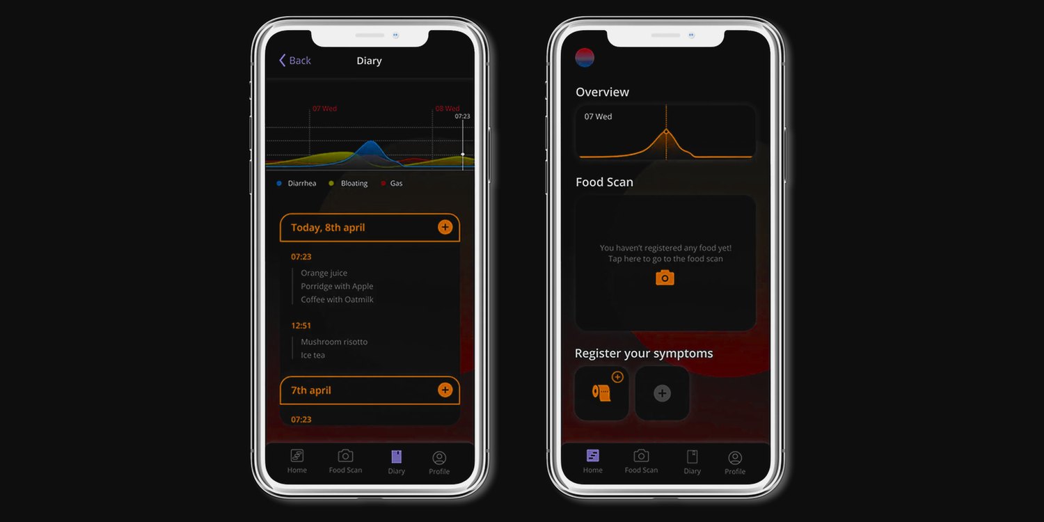
01 — See
The diagnosis needs a diary. The diary needs daily effort.
For people investigating a possible food intolerance, recording meals, symptoms and daily context can become a repetitive task. Specialists need that history to look for patterns, but incomplete or inconsistent entries make it harder to use. We focused on young adults, who often turn to online resources before seeking professional advice.
20%
Up to one in five people may have a food intolerance.
Healthline
10 of 11
respondents with regular digestive problems had lived with them for more than three years.
Our survey
5 of 11
felt their healthcare professional didn’t take their concerns seriously. Only 3 of all 28 had a diagnosis.
Our survey
One diary, two perspectives
Patient
Less effort.
A diary that’s manageable to keep, every day, for weeks.
“Getting help would almost feel weird, but also very much appreciated.”
Patient 14 · food diary study
Specialist
More context.
Everything recorded, in one place.
“A digital food diary in combination with health specialists is really great and timesaving.”
Medical student · expert interview
Where we intervened
The weeks alone with the diary.
The hardest stretch is repeated self-recording, when patients have to stay motivated without immediate feedback. That’s where we focused.
| Onset | Informing | Getting help | Intake | Testing | Analysing | Diagnosis | |
|---|---|---|---|---|---|---|---|
| Doing | Slight digestive problems start | Reflects on symptoms, researches online | Looks for a specialist, or goes it alone | Talks to the specialist | Tests, food diary, exclusion diet | Waits for results, reflects on data | Diagnosis, or none |
| Pain points | Discomfort, stress, social limits | False self-diagnosis, overwhelm | Slow, little empathy | Little time, little empathy | Tedious, frustrating, motivation drops | Can’t interpret data alone | No diagnosis, or restrictions |
| Opportunity | Early awareness | Reliable guidance | A trusted connection | Shared history | Effortless logging + buddy | Clear overview for both | Follow-up and support |
Patient journey, from first symptoms to diagnosis · the two stages Digesti was designed for are marked · swipe sideways for all seven stages
The finding that set the direction
Finding · survey and 5-day diary study
Recording meals and symptoms became tedious.
Implication
Reduce manual work without preventing corrections.
The evidence behind it method · 2 more findings · 5 closest products · 4 requirements · 4 personas
The challenge wasn’t simply making food logging faster. We needed to understand what made patients stop recording, and which details specialists actually needed. We reviewed 9 papers, benchmarked 20+ products and ran a 5-day diary study with the team and friends.
Finding 02
Patients wanted guidance, but were wary of an app’s diagnosis.
→ Be supportive, and connect to a healthcare professional.
Finding 03
Specialists needed history and context, not single records.
→ Bring meals, symptoms and context into one overview.
| The closest products | What each one does |
|---|---|
| mySymptoms | Food and symptom journal to find IBS triggers |
| CaraCare | Gut-health diary, one of the few linked to a specialist |
| Foody | Personal diary for food and possible symptoms |
| Atlas | Photo diary that rates meals for gut bacteria |
| Mijn Eetmeter | Nutrients and calories, with tailored advice |
Five of the 20+ products we benchmarked
Most products were quick but narrow, or broad but slow to fill in; few were linked to a specialist. Asked about the problems they met with food diaries, survey respondents named time above everything else.
How might we keep patients logging without costing them time, and help specialists review a patient’s history?
Effortless
Log a meal with one photo; nothing is mandatory.
Kind
A chatbot buddy that guides, without judging.
Complete
Meals, symptoms, stress and sleep in one history.
Connected
Linked to a specialist; the app doesn’t diagnose.
Constraints: needs a connection and a third-party food-recognition API; health data must stay private; specialists can’t be flooded with raw data.
The hardest stretch is repeated self-recording, when patients have to stay motivated without immediate feedback. Four personas, four barriers to keeping a diary: Bill, 22, the effort-avoider; Sheldon, 25, the self-diagnoser; Karen, 27, the worried researcher; Deborah, 18, the forgetter.
02 — Understand
Three decisions behind the product.
What is easiest for the patient isn’t always most useful for the specialist; each decision balances the two.
Decision 1 · Food logging
Scan, then correct.
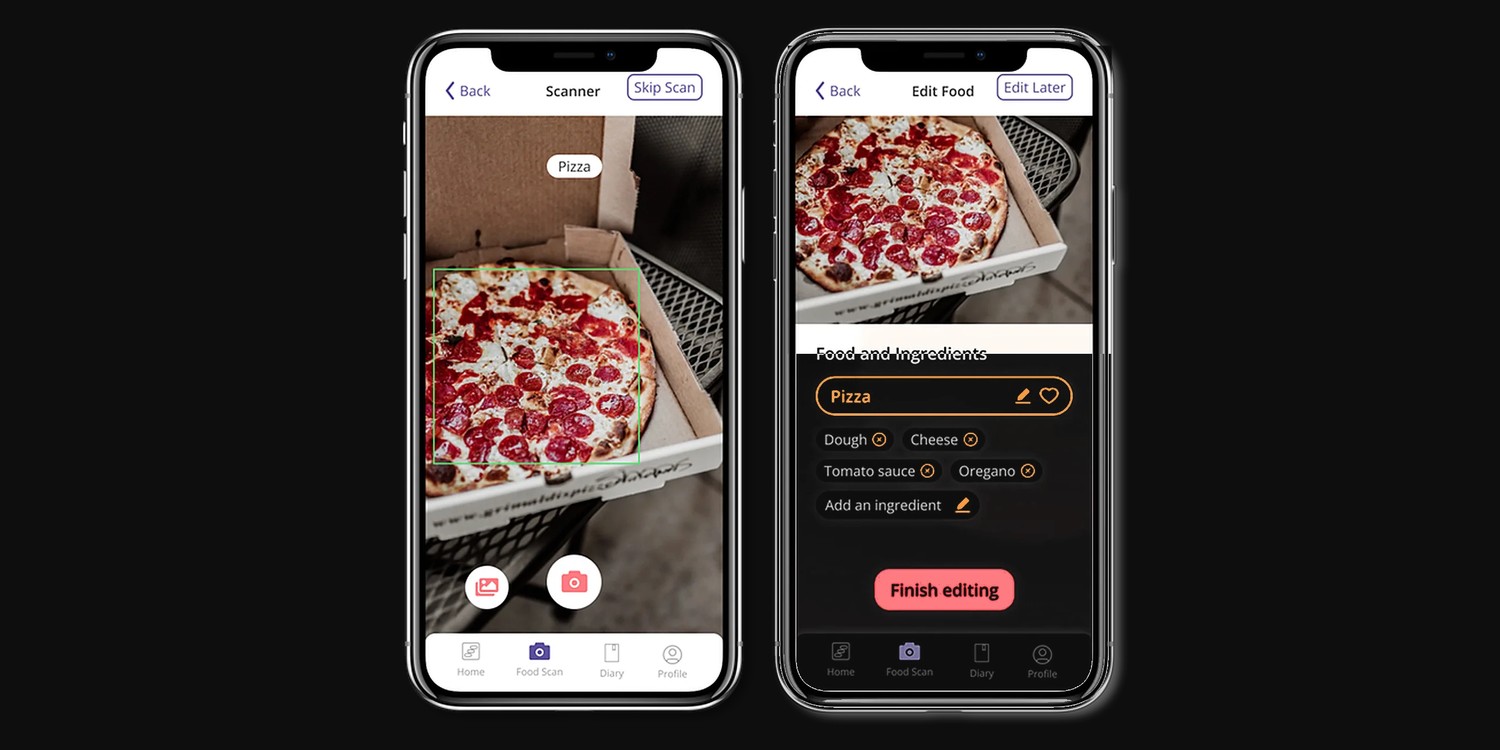
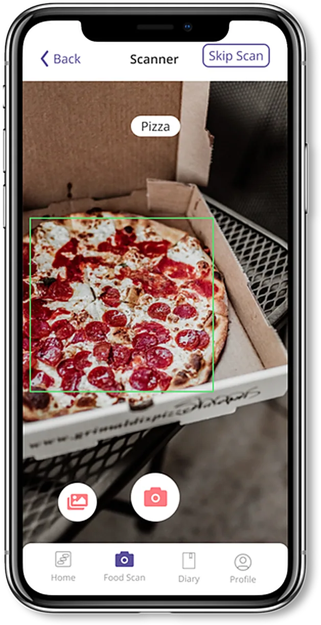
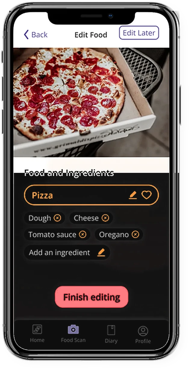
We dropped the prototype’s “Am I correct?” step, saving a tap on every meal: the photo proposes the dish, and patients fix ingredients on the next screen. Everything else stays optional, because our nutritionist warned that strict logging can encourage obsessive behaviour.
The trade-off
Accuracy against effort: recognition can be wrong, but confirming every meal costs time. Corrections stay possible, only where they are needed.
Prototype
- Scan
- “Am I correct?”
- Edit ingredients
Final design · one blocking step fewer on every meal
- Scan
- Edit ingredients, only if needed
1 · Scan
The photo proposes a dish.
2 · Correct
Ingredients stay editable before saving. Fix only what’s wrong.
Decision 2 · Chatbot
A guided conversation.
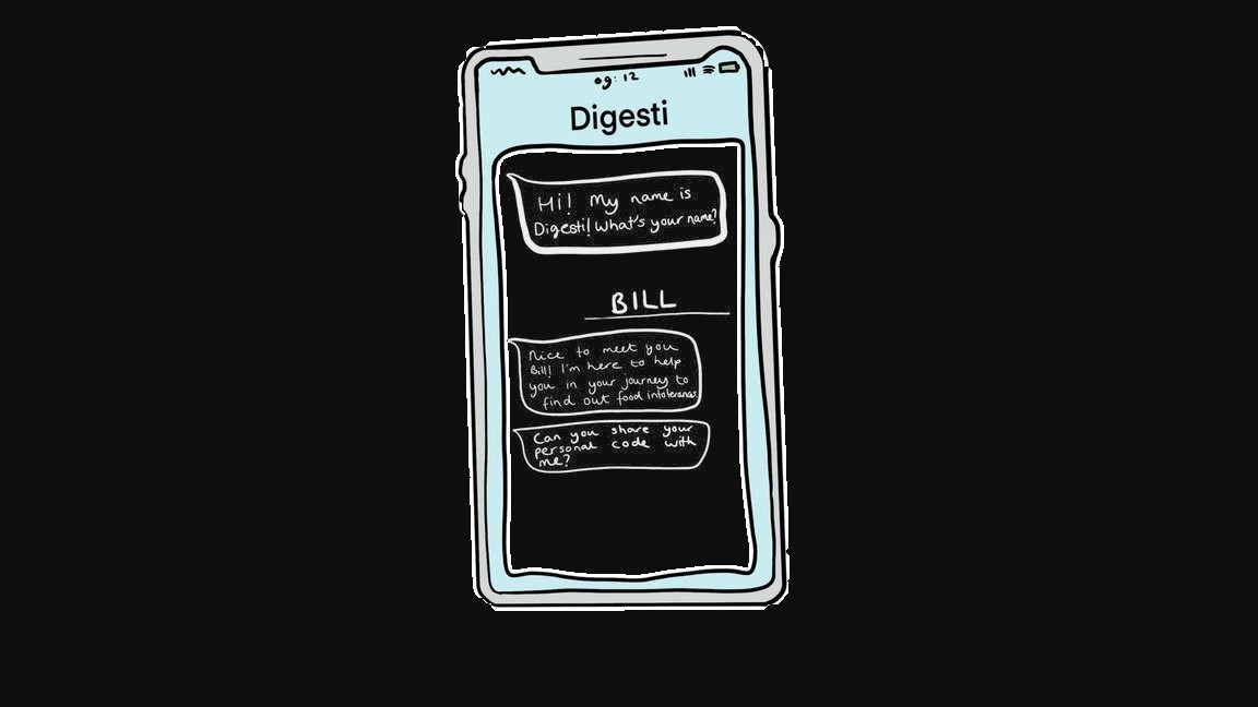
A chatbot buddy sets patients up without forms or judgement.
The trade-off
Guidance against authority: patients wanted help but distrusted an app’s diagnosis, so the chatbot guides and collects, and the judgement stays with the specialist.
Connects
Links the patient to their specialist with a personal code.
Learns
Asks about symptoms with predefined answers.
Prototyped
Built in Landbot for testing.
In the first test
Trust in the chatbot 5.25 of 7; perceived empathy 3.33 of 5, a moderate score.
Decision 3 · Specialist experience
From individual entries to a patient history.
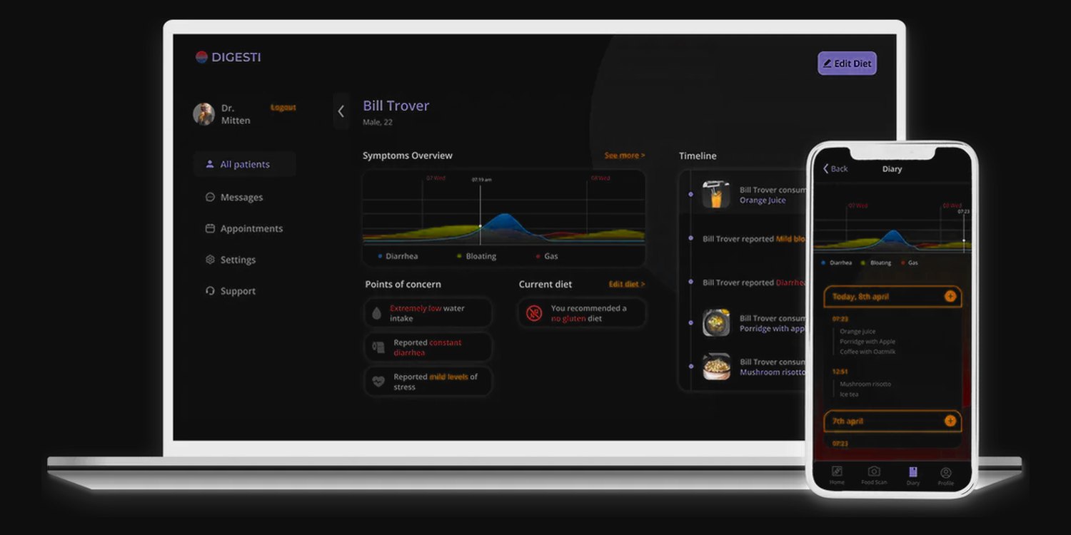
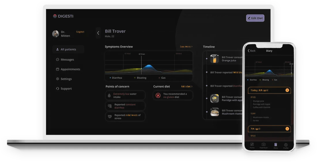
The specialist dashboard brings symptom trends, dietary context and patient history together in one interface for review.
The trade-off
Patient convenience against specialist needs: quick entries only become useful when they add up to trends, concerns and a timeline a specialist can scan.
1
Symptoms over time
A chart compares reported symptoms across dates, so the history reads as trends rather than isolated records.
2
Points of concern and current diet
Summary cards flag relevant observations, with the patient’s current diet alongside.
3
Patient timeline
A chronological feed of symptoms, meals and diet events, for reviewing individual records in context.
Concept and flows 3 scenario sketches · 11 flow diagrams · the system architecture
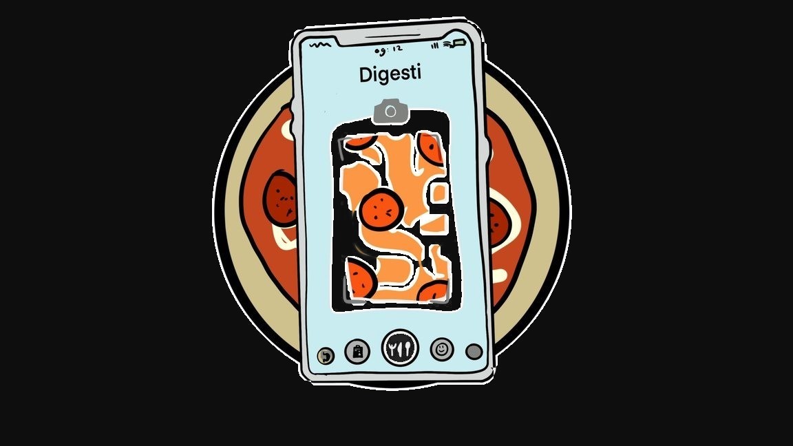
Sketches and scenario videos led to one system: photo logging, a guiding chatbot and a shared history. The overview answers “how am I doing?” first; logging stays one level deep, and the chatbot is reachable from every screen.
Scenario 1
Snap a meal, done.
Scenario 2
A conversation instead of a form.
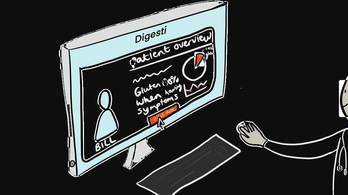
Scenario 3
The specialist reads the diary.
Quick mode takes returning users straight to the food scanner. New users register and set up their profile through the chatbot, then reach the main menu. When the specialist changes the diet or sends feedback, a notification opens the chatbot; it explains the change and answers questions.
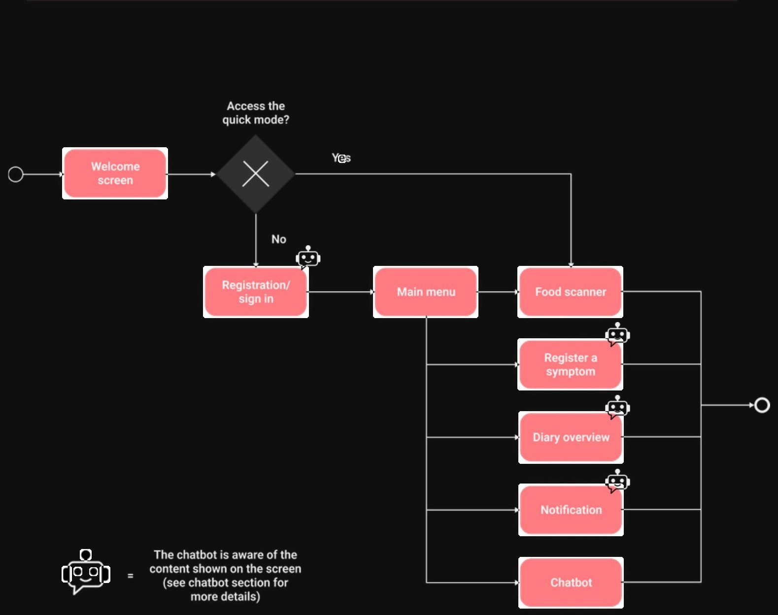
Onboarding and navigation
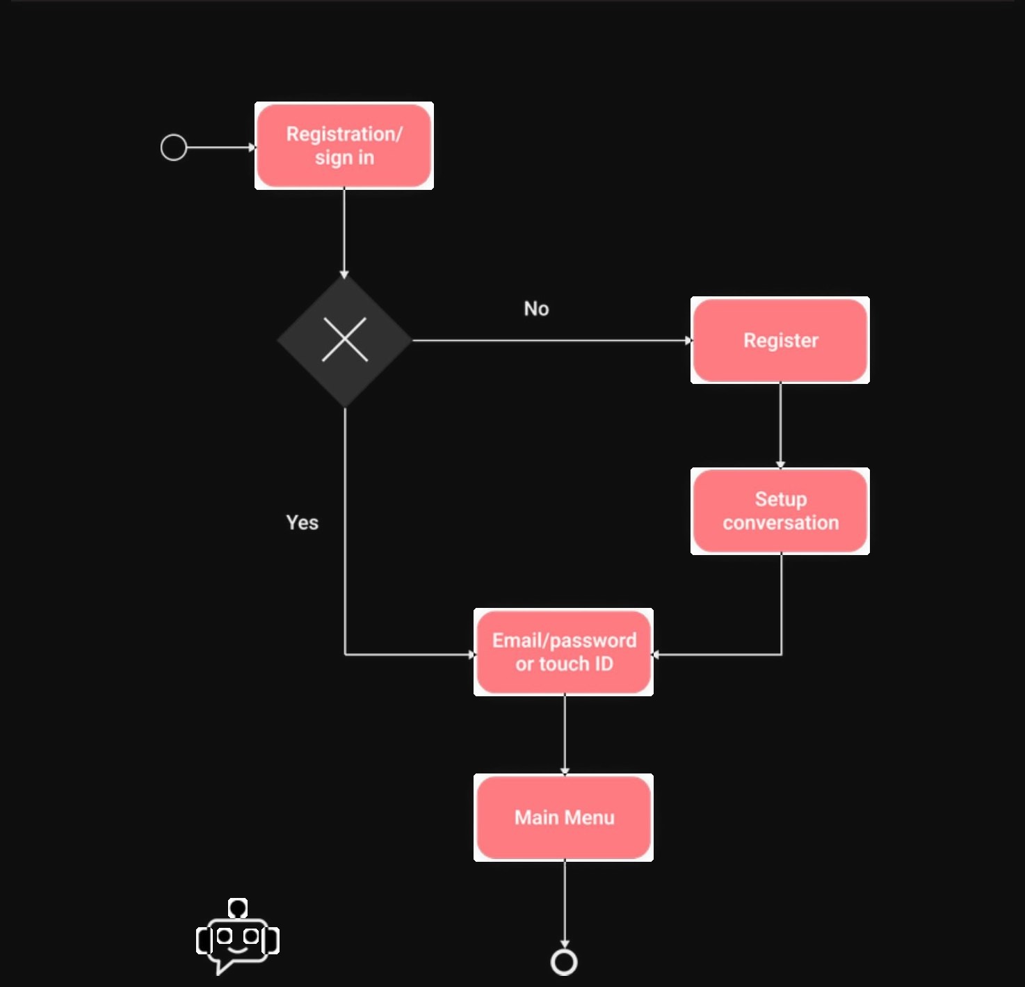
Registration · flow
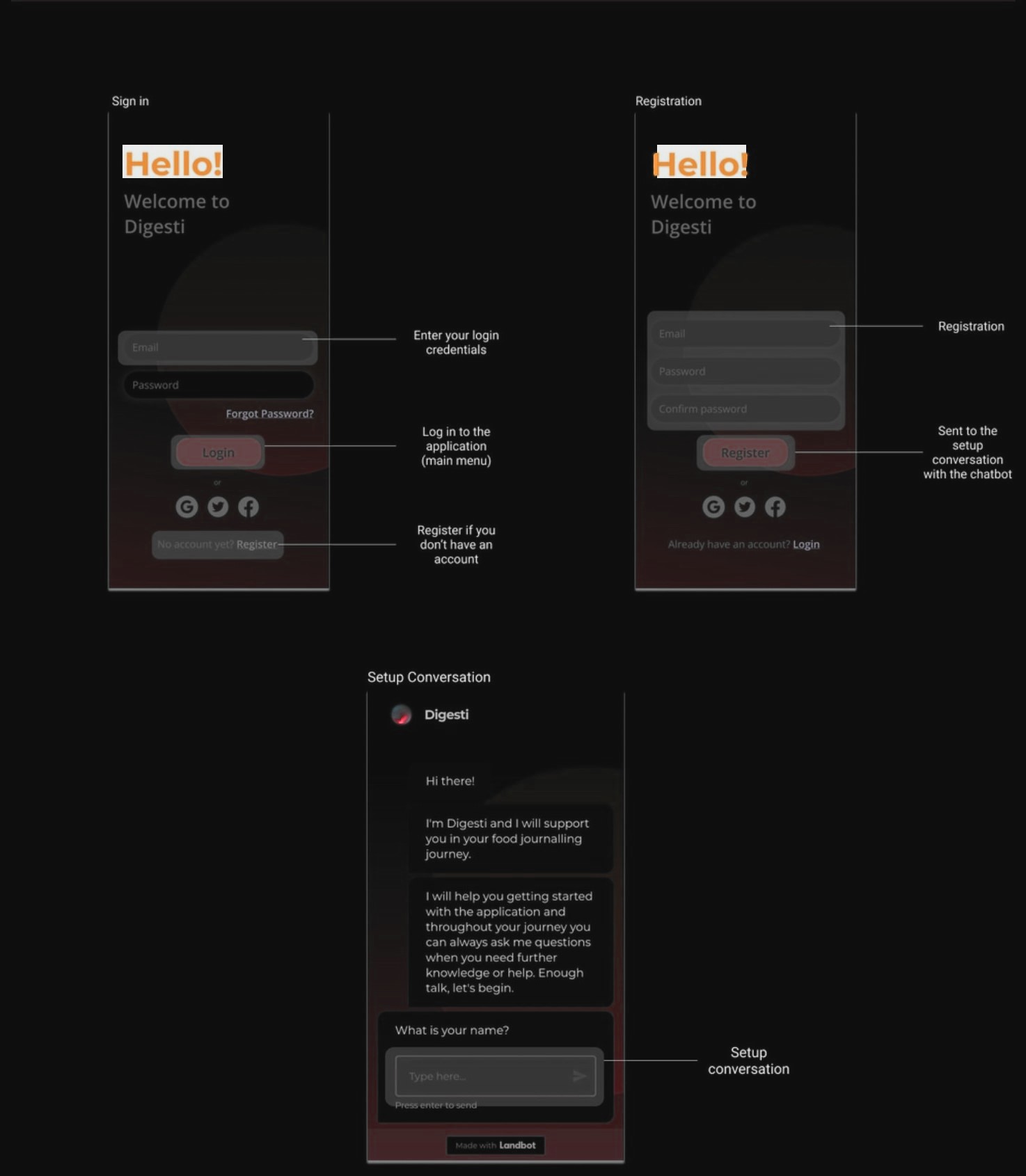
Registration · screens
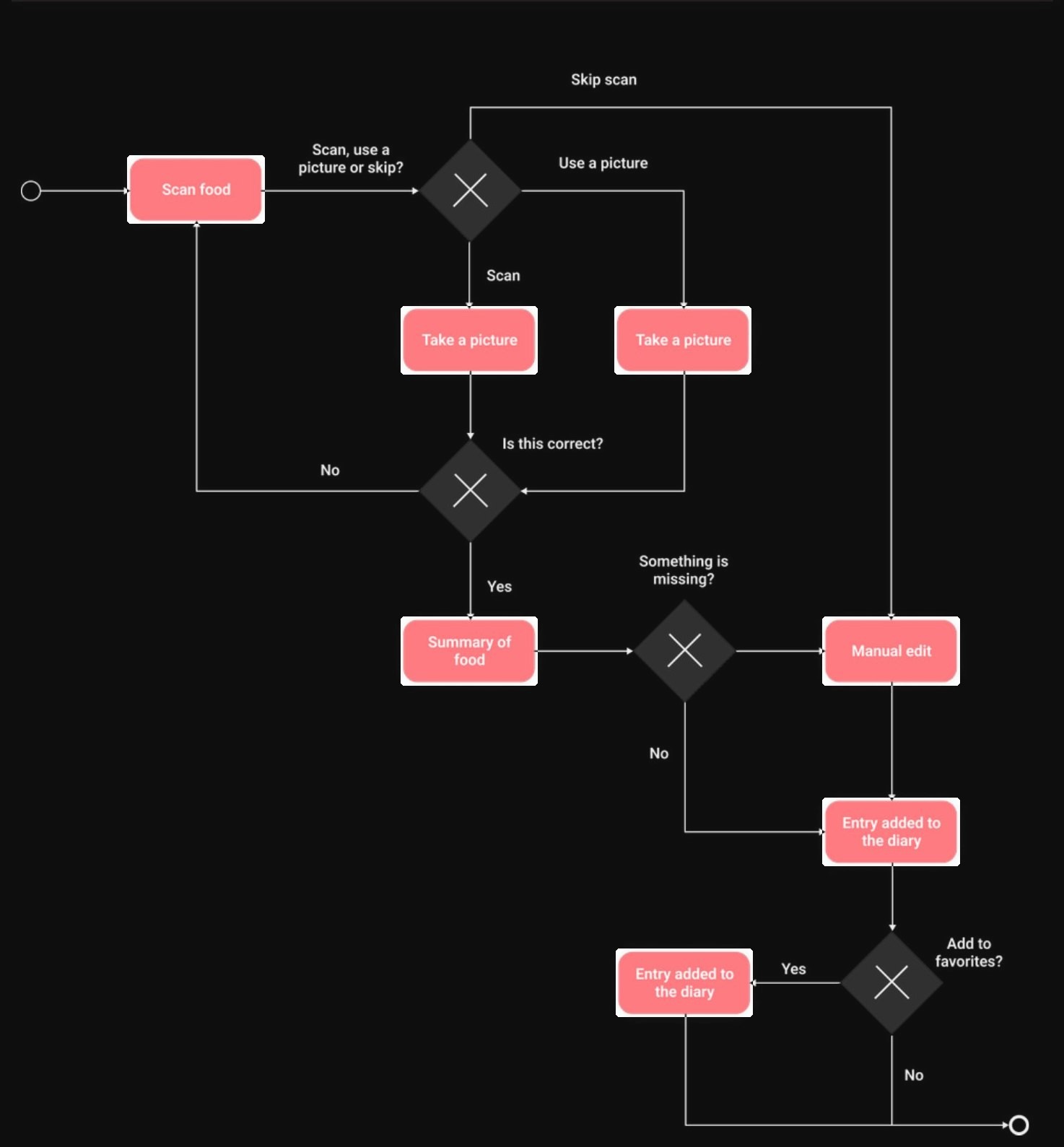
Food scan · flow
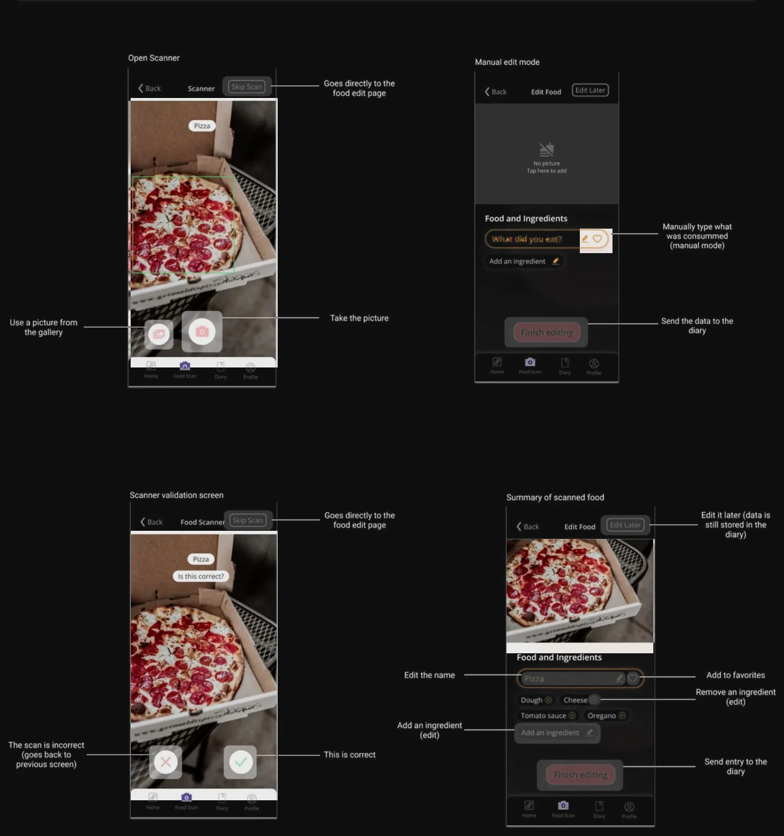
Food scan · screens
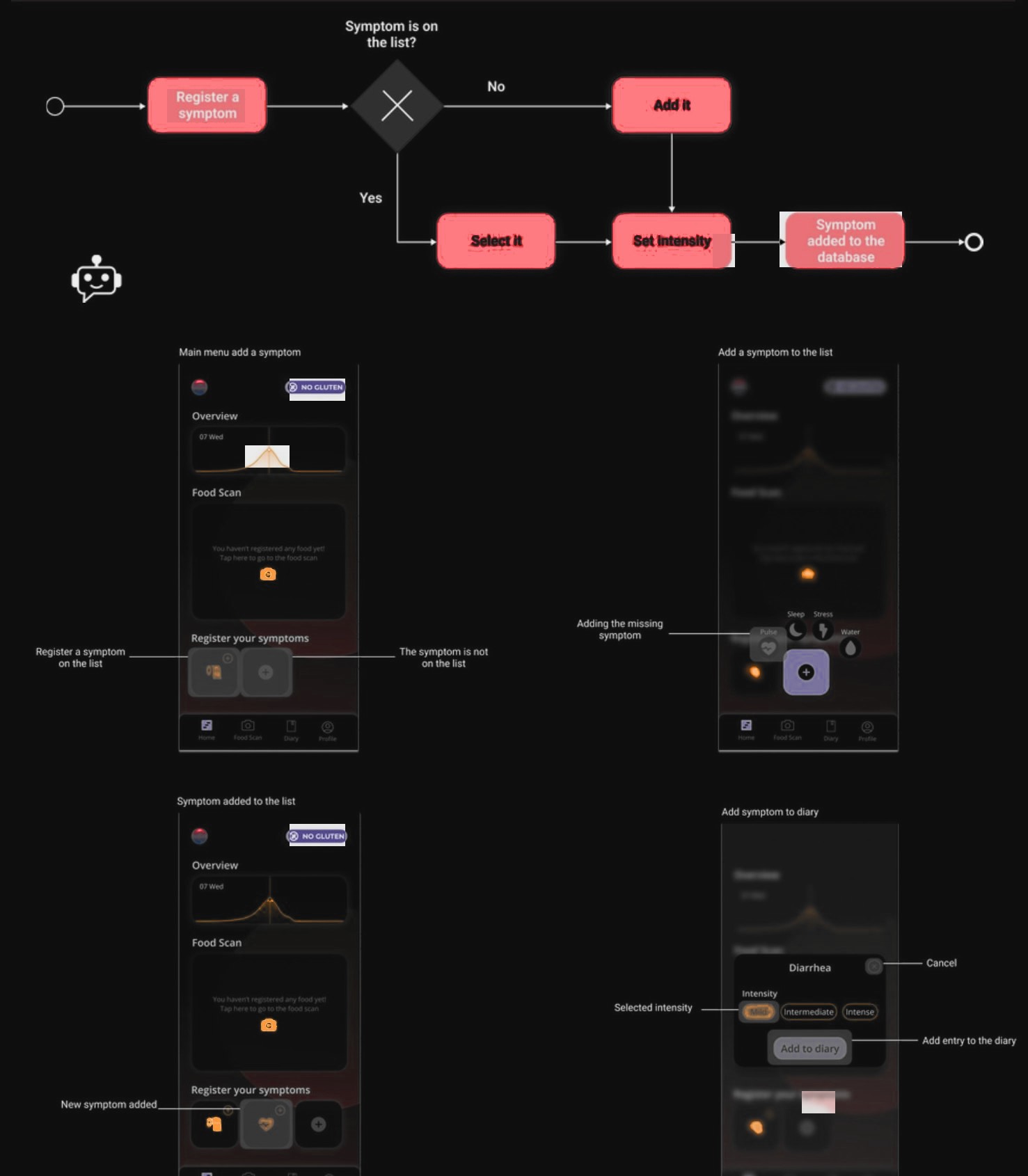
Register a symptom
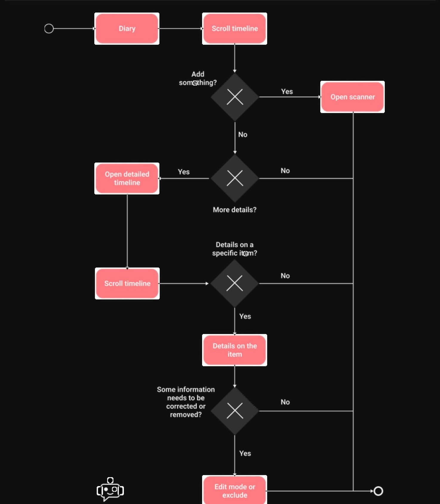
Diary · flow
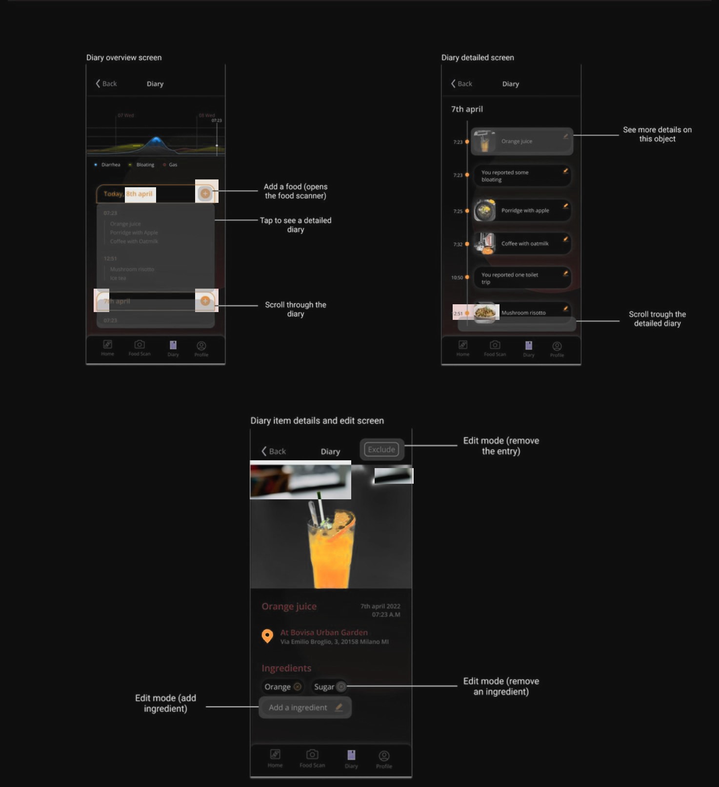
Diary · screens
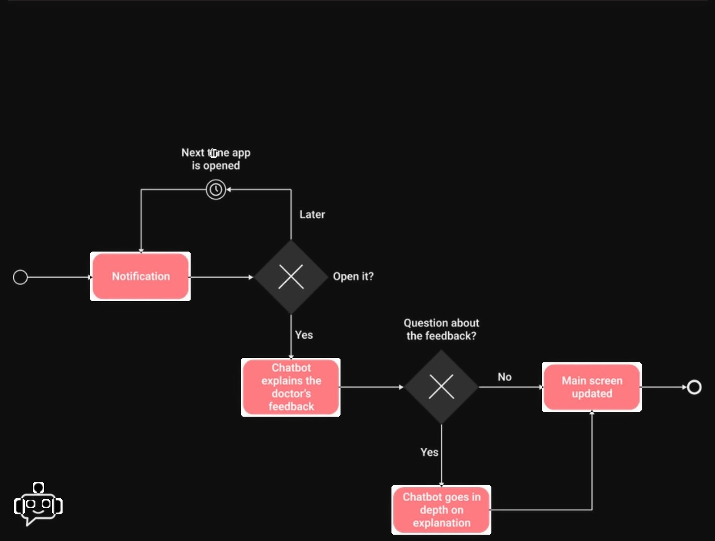
Specialist feedback · flow
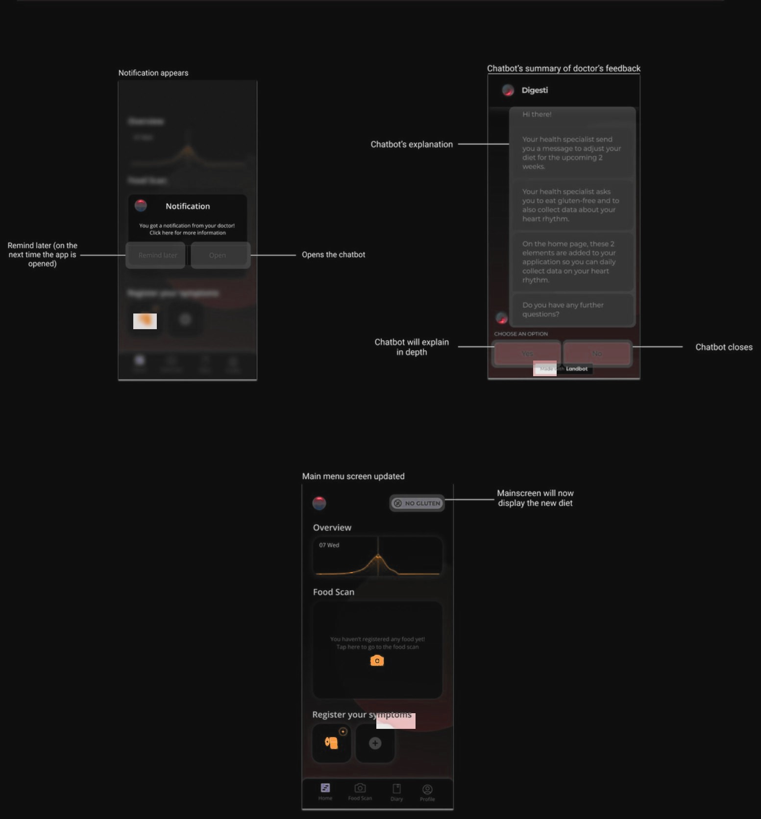
Specialist feedback · screens
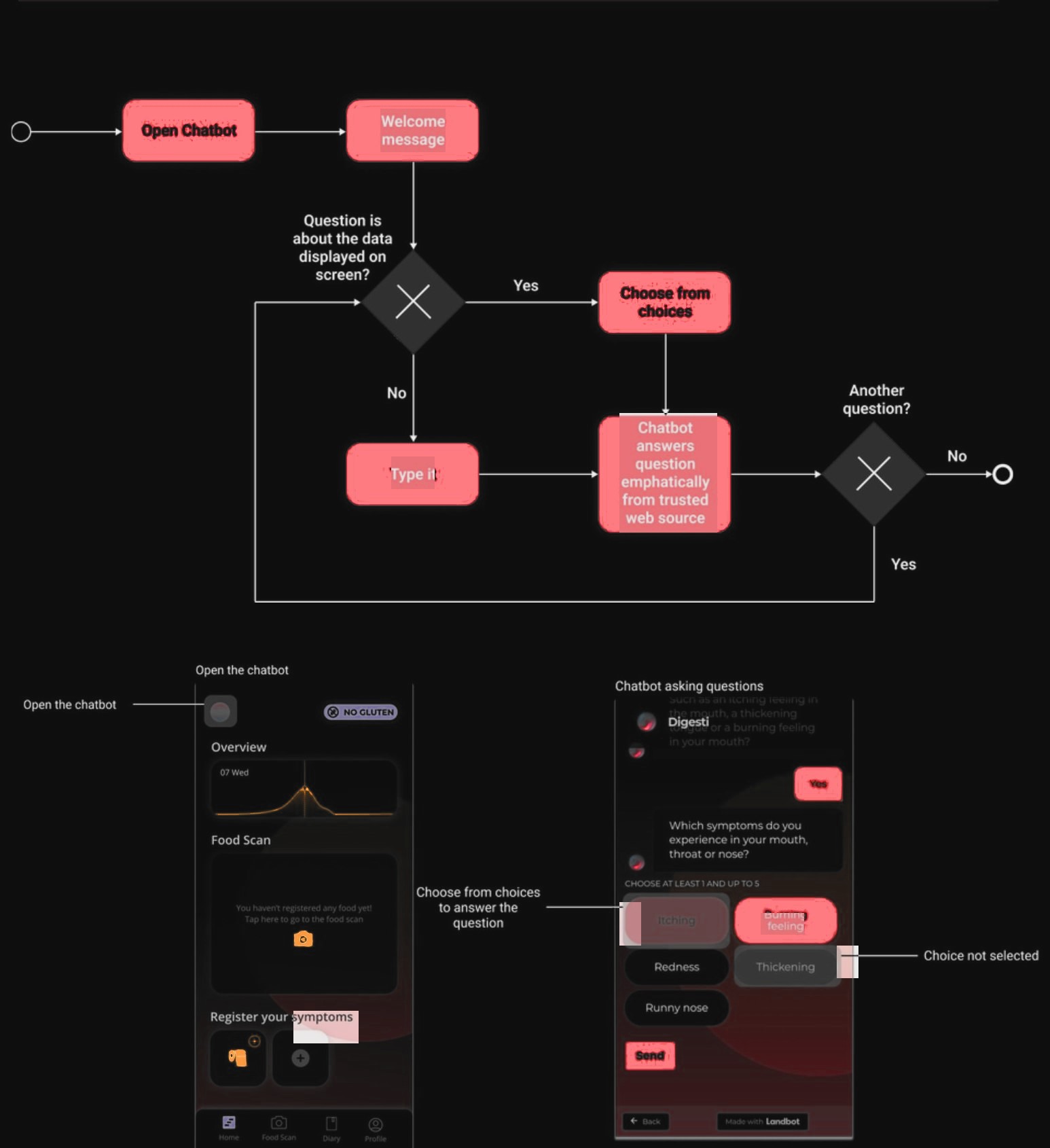
Chatbot
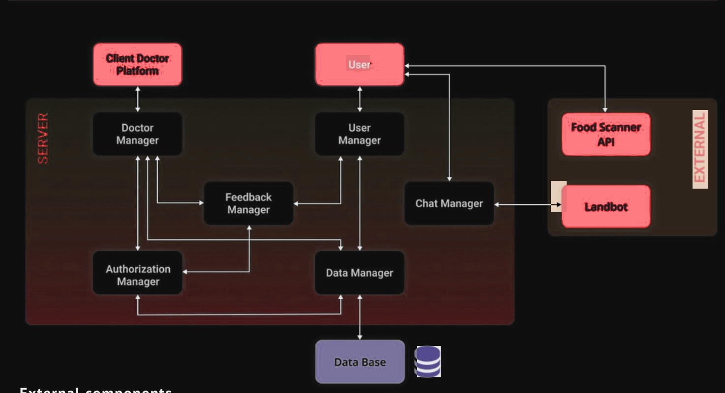
System architecture
The team’s flow documentation and the system architecture · select one to open it full size
Iterations greyscale to final · 4 screens · what changed and why
Food capture got quieter, a tab bar replaced the menu, and the specialist page grew into concerns, diet and history. The earlier specialist prototype combined an overview chart with five metric tiles. We reorganized the dashboard around flagged concerns, dietary context and a timeline.
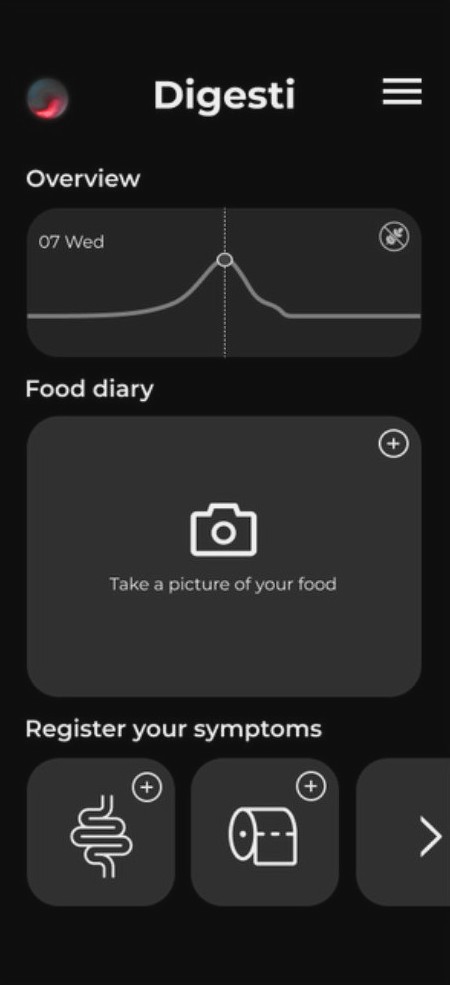
Greyscale 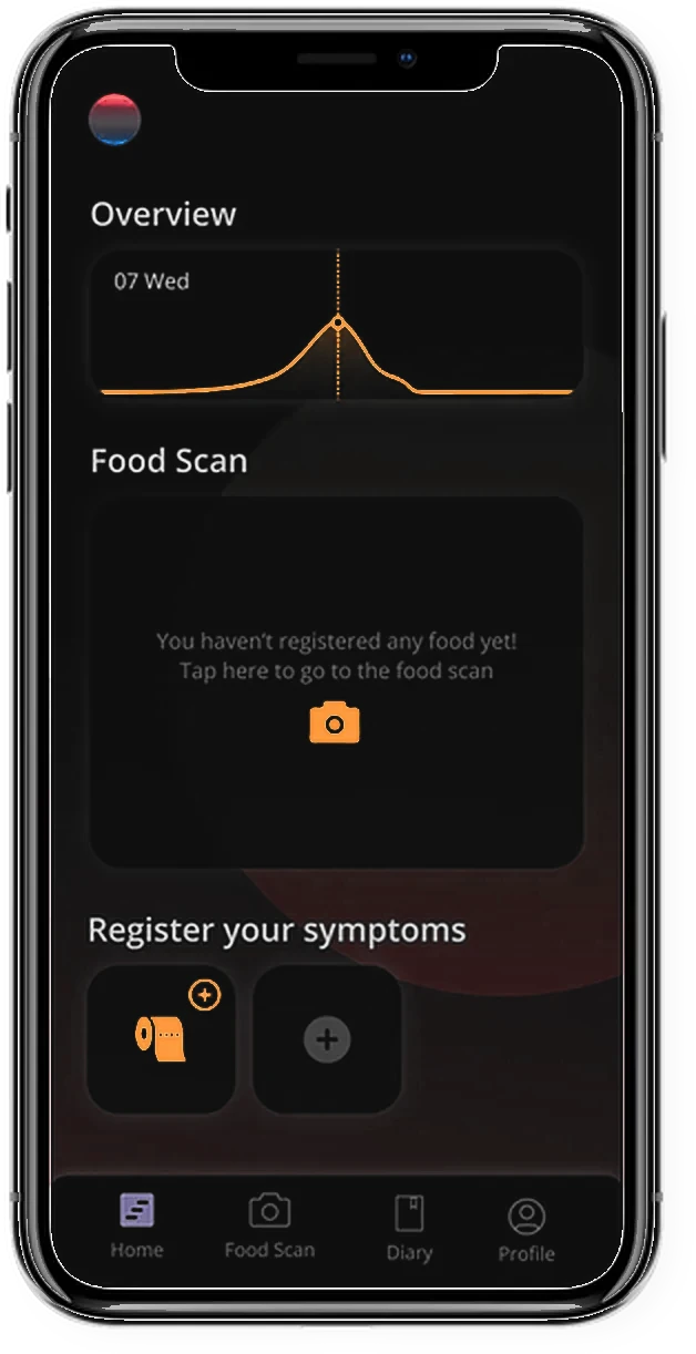
Final Overview
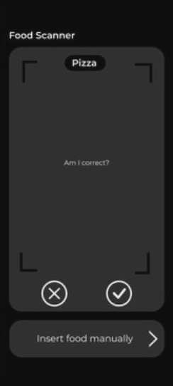
Greyscale 
Final Scanner
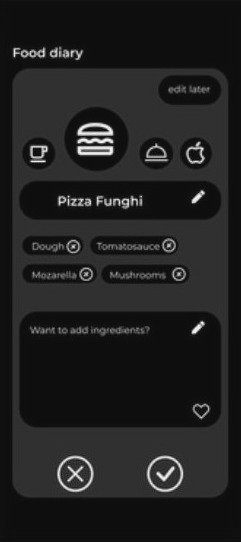
Greyscale Final Edit food
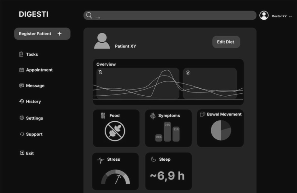
Greyscale 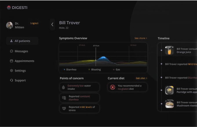
Final Specialist page
On the specialist page we removed five metric tiles and a placeholder patient card, and added flagged points of concern, the current diet and a timeline of meals and symptoms.
Overview
To keep the symptom trend as the focus while making food capture quieter, with the scanner one tap away in the tab bar.
Scanner
To keep logging moving: the scanner suggests the dish, and any correction happens on the next screen rather than in a blocking yes/no step.
Edit food
To keep entries accurate with less typing: a wrong ingredient is removed as a chip, not retyped.
03 — Make clear
Quick to log, structured to review.
Manageable daily logging for patients, and a history specialists can review over time. Patients start a meal entry with a photo, correct the recognised ingredients when needed, and use a chatbot to record additional context.
01 · Patient records
A photo of each meal, symptoms through the chatbot.
02 · Digesti structures
Recognised ingredients and symptoms on one shared timeline.
03 · Specialist reviews
Trends, flagged concerns and diet in one patient history.
What the first test told us
Four participants played Bill, our effort-avoider, in 20–30 minute sessions with the Figma and Landbot prototypes. Four people and one short session each: these are first signals, not proof.
Trust in the chatbot
Perceived empathy, a moderate score
UEQ scales rated excellent
Test participants
Worked
Clear, efficient and attractive: rated excellent on three UEQ scales.
Needs work
Less engaging day to day: stimulation and dependability rated lowest against the benchmark, and the chatbot scored low on being available to talk.
Not yet tested
The specialist app, with specialists.
User Experience Questionnaire · approximate mean per scale, read from the chart in the 2022 report (p. 111)
- Attractiveness2.0excellent
- Perspicuity2.1excellent
- Efficiency2.0excellent
- Dependability1.2above average
- Stimulation1.2above average
- Novelty1.1above average
−30 · neutral+3
Full UEQ scale, −3 to +3 · n = 4, sessions of 20–30 minutes · ratings are the UEQ benchmark categories · first impressions, not generalisable findings
What we established
Established
Logging felt clear and efficient in a short test.
Still unproven
That patients keep logging for weeks, and that specialists review a history faster.
What I learned · Design the input as carefully as the output
Reduce effort without hiding errors
Photo recognition helps only when patients can still correct the result.
Support, don’t diagnose
Patients wanted guidance but distrusted an app’s diagnosis, so Digesti hands the judgement to their specialist.
Design both sides of shared information
What feels like a quick diary entry to the patient becomes part of a longer history for the specialist.
Before launch 3 things still to do
Still open
Test the specialist side
Sessions with doctors and nutritionists, since the specialist dashboard was never tested with the people it was for.
Still open
Design for week three
Stimulation rated among the lowest against the benchmark. Add gentle motivation for daily logging, then run a multi-week patient pilot instead of a 30-minute session.
Still open
Decide the measures first
Diary completeness, continued use to the end of an exclusion diet, and the time a specialist needs to review a history.
Next project · 04
A Highway to Greenness.
How car brands make their models look green.