Log-e · B2B SaaS · Logistics · 2023
Pin2Pin.
Making deliveries visible without another phone call.
Status calls after launch, as reported by Log-e
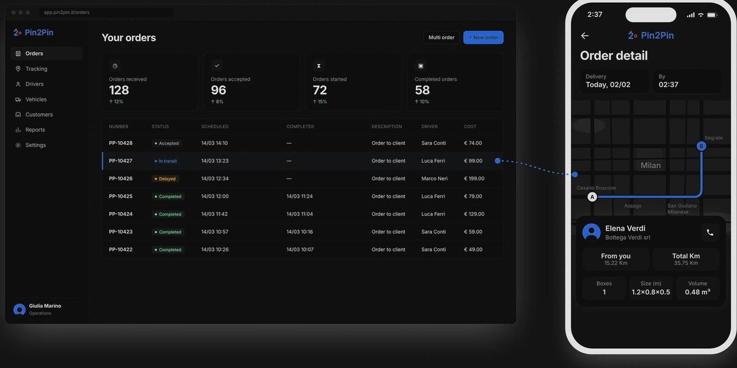
Connected interfaces: office dashboard and driver app
Rounds of usability testing
2023 at Log-e
Role, scope and status my contribution · 5 facts
I designed the UX and UI of the dispatcher dashboard and the driver app, from understanding operational workflows through interface design, usability testing and design QA. My work focused on three challenges: making delivery status visible to the office, reducing complexity for drivers, and designing reliable handover verification.
| Timeline | 2023 at Log-e |
| Context | Designed at Log-e, for one of its clients |
| Platforms | Web dashboard for the office, mobile app for drivers |
| Users | Dispatchers, drivers and fleet admins |
| Status | Launched, refined release by release |
01 — See
The tools tracked vehicles. The office still couldn’t see the order.
An expensive problem: the office had to call to know.
Pin2Pin is a platform for logistics, rental fleets and on-location services. Before it, an order’s status lived in phone calls to the driver, and a handover left no record. Pin2Pin follows each order from the office that plans it to the driver who delivers it.
Before the first order
Long setup
Long configuration and dedicated hardware before any value.
While orders move
No live view of orders
Status lived in phone calls to the driver.
When a box changes hands
Errors at the handover
Easy to make, and hard to prove.
The finding that set the direction
Insight · interviews and observation
Dispatchers depended on calls to know what was happening to an order.
Product decision
Make order progress visible in the dashboard.
The evidence behind it method · 1 more finding · positioning map · 3 roles
Interviews with 4–5 drivers and the office’s dispatchers and operations staff, observation of real pickups, deliveries and office work, and a review of 5–6 fleet-management apps.
Insight
Drivers needed the instructions before leaving, not on arrival.
→ Make essential pickup information immediately visible, with trip details one tap away.
The tools we reviewed were either complete but slow to set up, or quick but blind once an order left the office. None combined live order visibility, recorded handovers and quick setup. Each group is placed by how long setup takes and how much of an order’s journey the office can see.
Office
Dispatcher
Plans, creates and assigns orders all day, with many moving at once. Needs status at a glance, orders in a few clicks.
Road
Driver
Between stops, phone in one hand, often in a hurry and outside. Needs one clear primary action, with essential information readable at a glance.
Company
Fleet admin
Sets up the company, its vehicles and the link to the systems it already uses. Needs to get the fleet working without a long configuration first.
02 — Understand
Three design decisions that changed the delivery workflow.
Each follows the same pattern: the problem, the options, and the decision with its trade-off.
Decision 1 · On the road
A driver shouldn’t have to call to know what’s next.
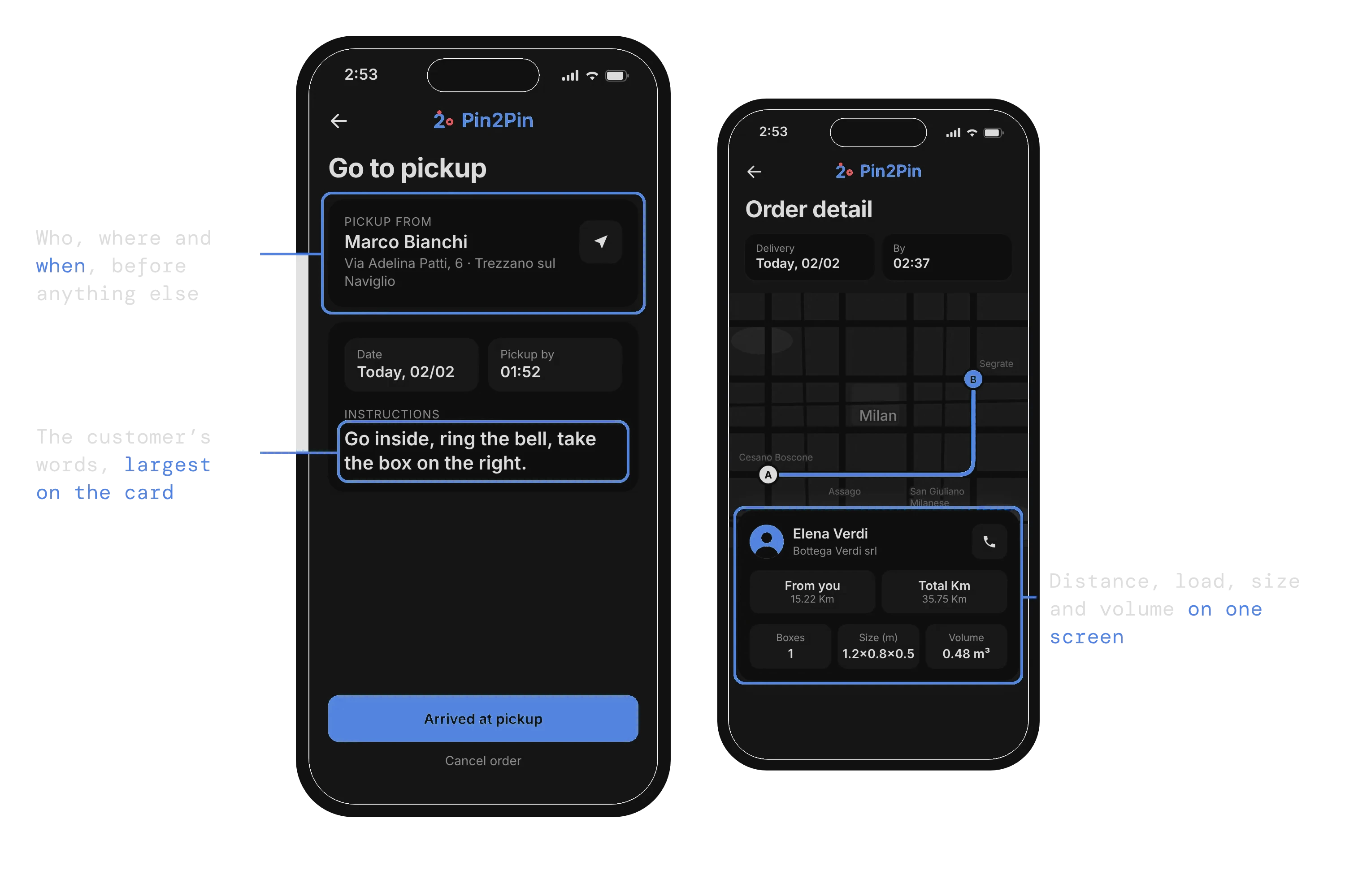
Drivers told us they don’t need a complicated app, they need to know what to do next. When instructions hide in the details, the fallback is calling the customer from the van, or opening three screens to prepare one trip.
The trade-off
A minimal pickup screen would look cleaner, but it would force drivers to search for the customer’s instructions before leaving. I prioritised who, where, when and the customer’s notes, and kept detailed trip specifications one tap away. The pickup card is denser; drivers get the context without extra navigation.
Decision 2 · At the handover
A handover shouldn’t depend on memory.
Pickup and delivery were the riskiest moments: boxes changed hands and nothing recorded it. A tick box would have been quick, but it proves nothing when something goes missing.
What we observed · real pickups and deliveries
Handover problems were impossible to investigate without a record.
Boxes changed hands and nothing recorded it.
Product decision
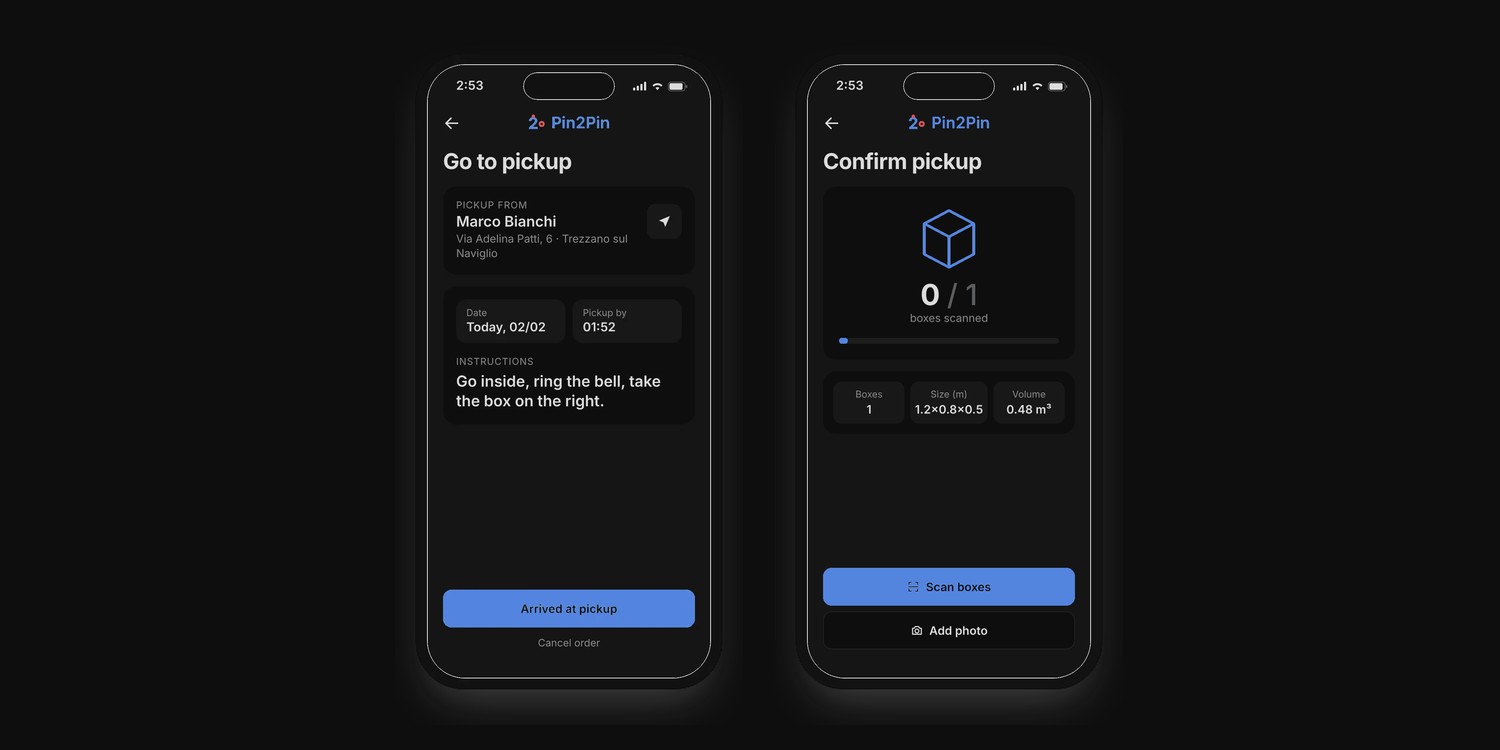
Make scanning and counting required, with an optional photo.
On the same screen · Count
Know what’s been scanned: the handover can’t be confirmed until the count is complete.
On the same screen · Scan, required
Verify the boxes: each one is scanned and matched against the count.
On the same screen · Photo, optional
Record the handover: one tap away, for damaged boxes or disputes.
Decision 2 · The trade-off
Every extra step slows a driver down, so the question was what proof is worth the effort.
The driver sees when the job is done; the office gets a record if something goes missing.
Decision 3 · In the office
The office needed answers, not another table.
Without a live view, knowing where an order was meant calling the driver. The office needed the state of the whole day and the detail of every order, and the two pulled against each other.
The trade-off
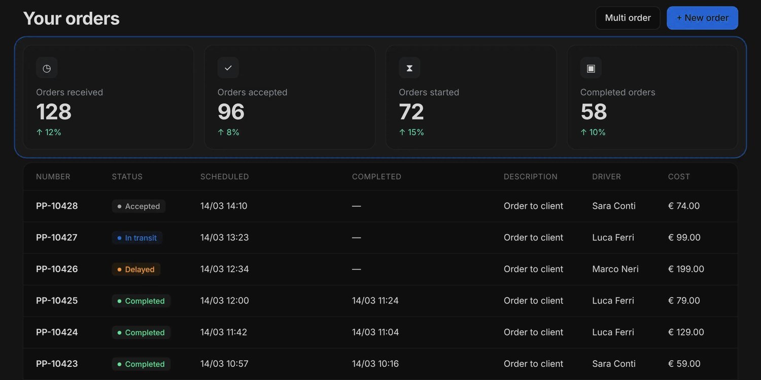
A summary-only dashboard would hide individual orders needing attention; all details at once made progress hard to scan. I chose a layered hierarchy: four counters (Received, Accepted, Started, Completed) give the overview, with the full order list directly below.
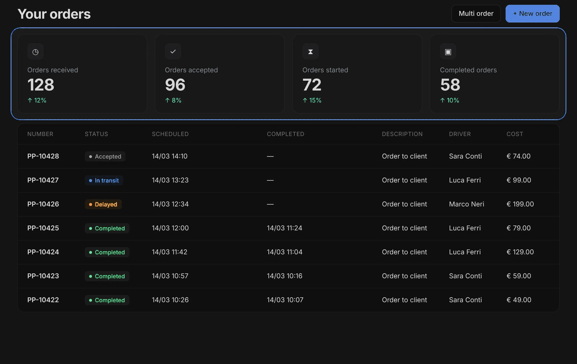
Not chosen
Summary only
Would hide the individual orders that need attention.
Not chosen
Everything at once
All operational details together made overall progress hard to scan.
Chosen
Overview, then detail
Four counters for the state of the day, with every order directly below.
Evidence from testing 20+ rounds · 3 changes they led to · the navigation diagram
Across more than 20 rounds of usability testing in 2023, drivers and office teams worked through the tasks they do every day: creating and assigning orders, preparing a pickup, and confirming a handover. Each problem was documented and guided the next release.
01 · Observed in testing
Dispatchers struggled to see order progress at a glance
The dashboard had no clear hierarchy: order status competed with detailed records.
→ Four order-stage counters above the full order list.
02 · Observed in testing
Inconsistent navigation made information harder to locate
Related features were organised and labelled differently in the dashboard and the driver app.
→ Shared terminology, including Orders and Tracking, across both interfaces.
03 · Observed in testing
Initial fleet configuration created unnecessary complexity
Setting up a company and adding vehicles needed assistance before teams could start.
→ Simplified company and vehicle setup. Reported result: company setup in under an hour, about ten minutes per vehicle.
03 — Make clear
One delivery, from pin to pin.
A connected dispatcher dashboard and driver app that let the office see every order and let drivers complete handovers they can prove.
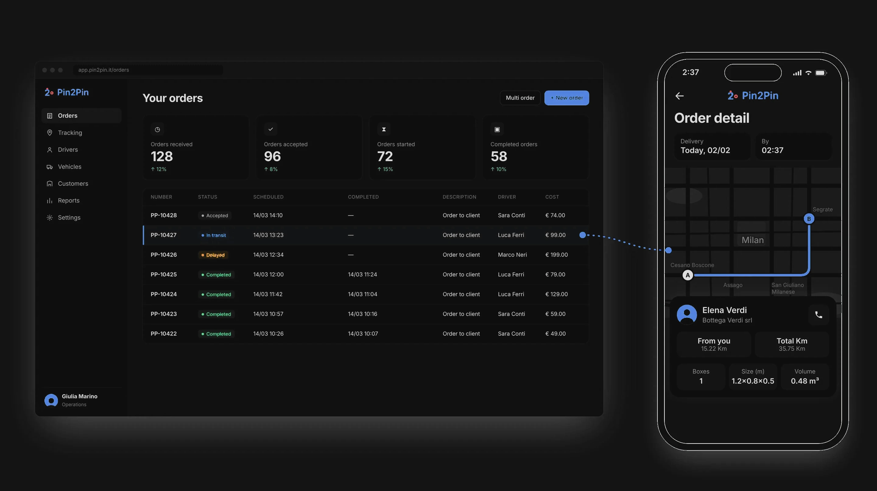
What changed after launch
−40%
Fewer status calls
Reported by Log-e after launch. Live order visibility gave dispatchers another way to check progress than phoning the driver.
About this number: it comes from Log-e’s own reporting. The measurement period and method were not shared with me, so it is shown as reported, not as a controlled measurement.
Also after launch
Handover accountability
Every handover is scanned and counted before it can be confirmed, with an optional photo, creating a record for investigating missing or disputed deliveries.
Simpler onboarding
Company setup under an hour and about ten minutes per vehicle, as reported. These are setup times, not before-and-after measurements.
Client response
Pin2Pin’s owner team was very happy with the result: a clear brand identity, a product that explains each step plainly, and a consistent visual design across the dashboard and the driver app.
What I learned
Design the handover.
Proof belongs inside the flow. Required scans and counts make errors traceable without adding a separate step.
Share the words.
When the office and the road use the same names, they talk about one order without translating.
The shipped experience 6 screens, in the order a delivery uses them
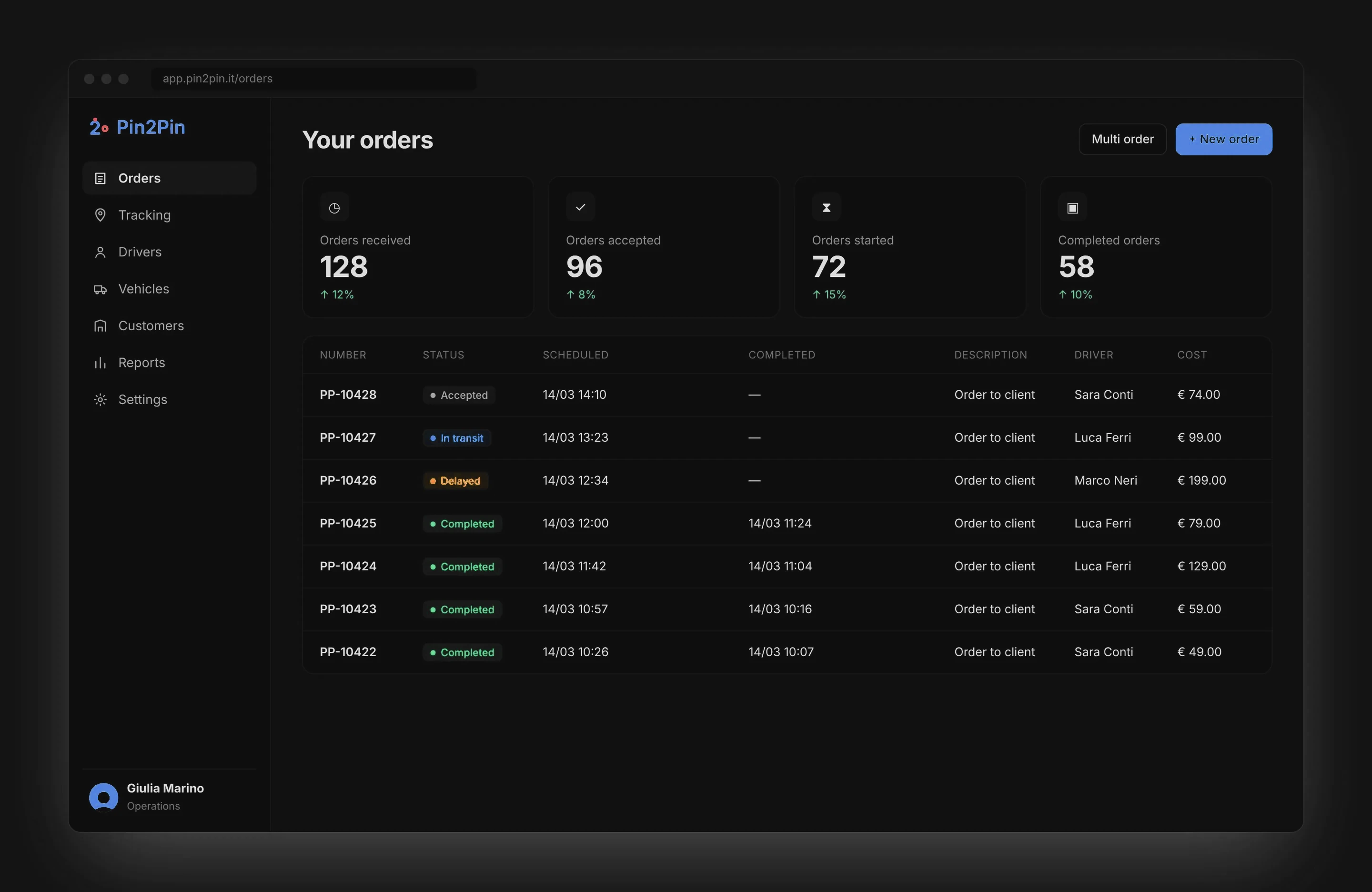
In the office · Create, assign, follow
Orders arrive from the ERP or are created here, then assigned. Only the state chip carries colour. Decision 3.
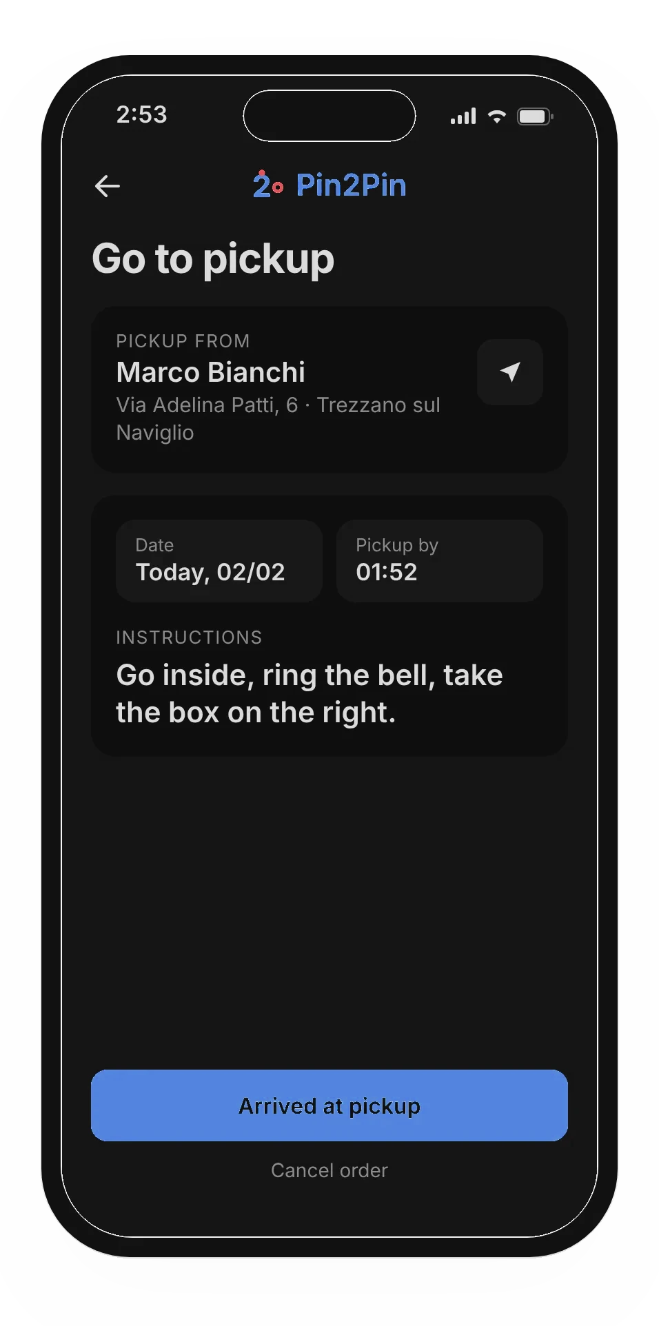
Step 1 · Go to pickup
Who, where and when, first. Decision 1.
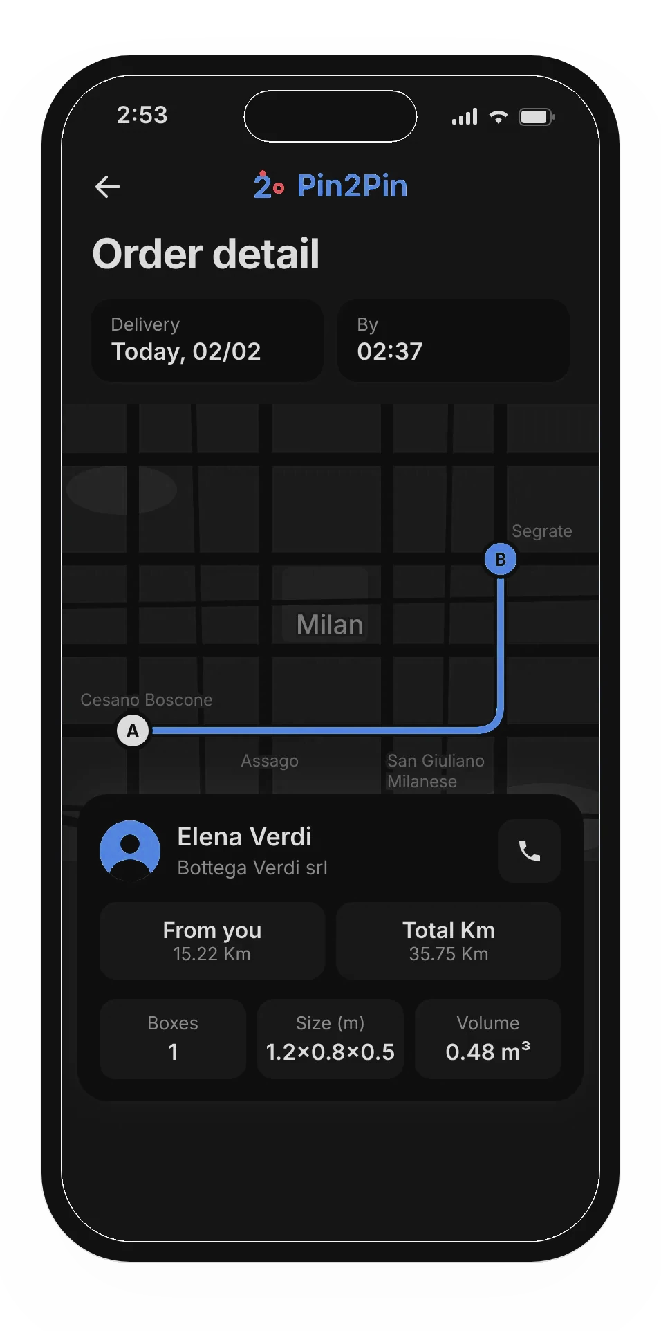
Step 2 · Check the trip
Distance, load, size and volume, one tap from pickup. Decision 1.
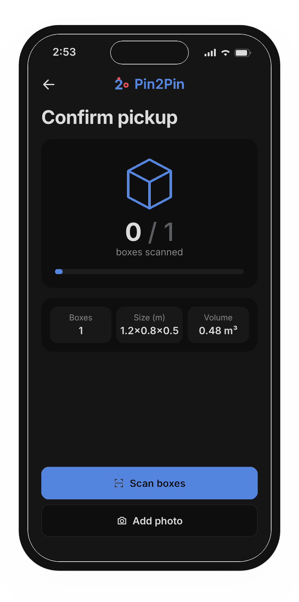
Step 3 · The handover
Scan and count every box; photo optional. Decision 2.
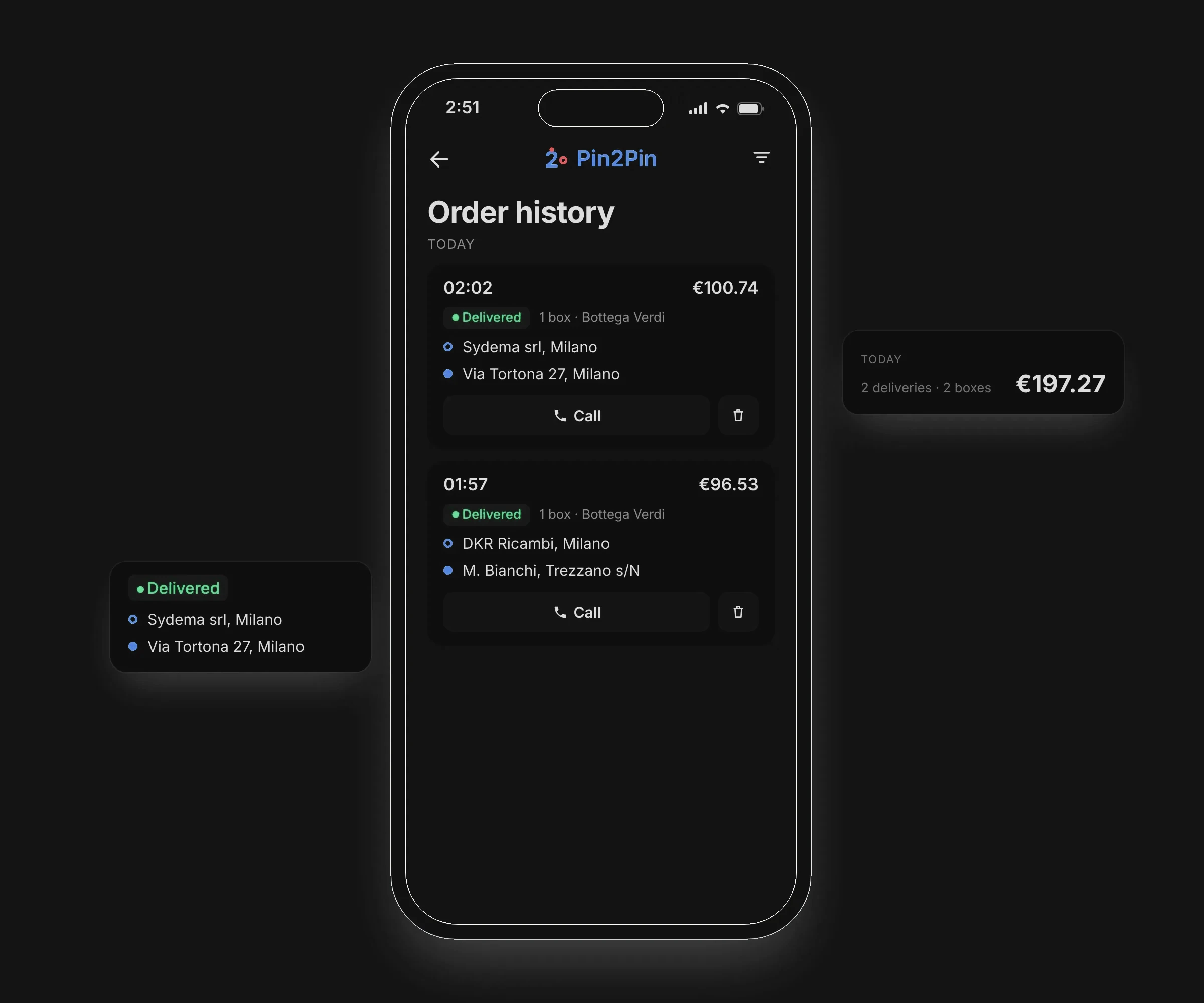
Step 4 · Lands in history
Every finished job lands in history with its price and status.
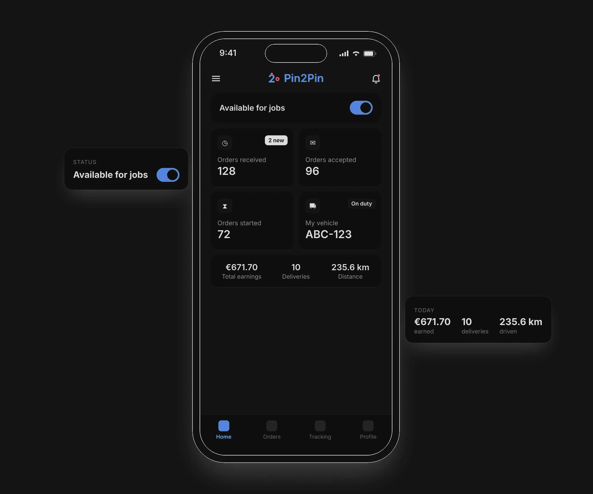
After the delivery · Manage availability
Drivers can change their availability from the home screen, alongside their daily earnings and distance.
Design system type · 8 colours · 16 icons
One typeface, a neutral scale, brand blue for the mark and a deeper action blue (5.1:1) for buttons and links.
| Type · Inter | Style | Example |
|---|---|---|
| Heading | Inter Bold · 26/32 | Go to pickup |
| Title | Inter SemiBold · 20/28 | Go inside, ring the bell |
| Body | Inter Medium · 15/22 | Via Adelina Patti, 6 |
| Label | Inter SemiBold · 13/18 | Arrived at pickup |
| Caption | Inter Medium · 11/16 · caps | Pickup by |
Brand blue
#2B7DE9 · Logo, illustration
Action blue
#1F6BD6 · Buttons, links · 5.1:1
Ink
#18181B · Headings, text
Muted
#71717A · Secondary text
Border
#E4E4E7 · Dividers, inputs
Surface
#F4F4F5 · Cards, chips
Delivered
#15803D · Status only
Alert
#DC2626 · Destructive only

Still open 2 things to do next
Still open
Measure the handover.
Track scan rates and pickup errors before and after each release, to turn “fewer errors” into a number.
Still open
Bring the receiver in.
A live tracking link for the customer, for fewer “where is it?” calls.
Next project · 03
Digesti.
One photo per meal; the specialist sees the whole history.