B2B brand identity · Visual communication · Website design · 2024
ST deburring.
Rebrand, art direction and website redesign for a thermal deburring company working since 1979.
ST Sbavatura Termica, Monza · thermal deburring since 1979
Five languages, one layout
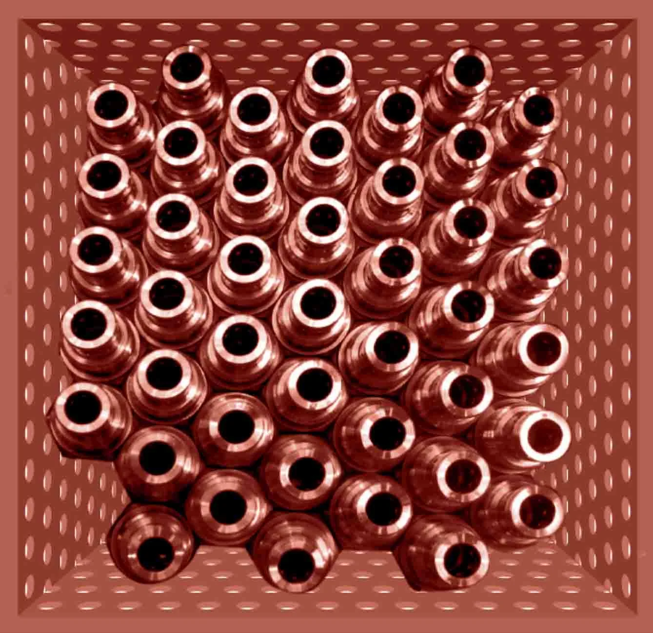
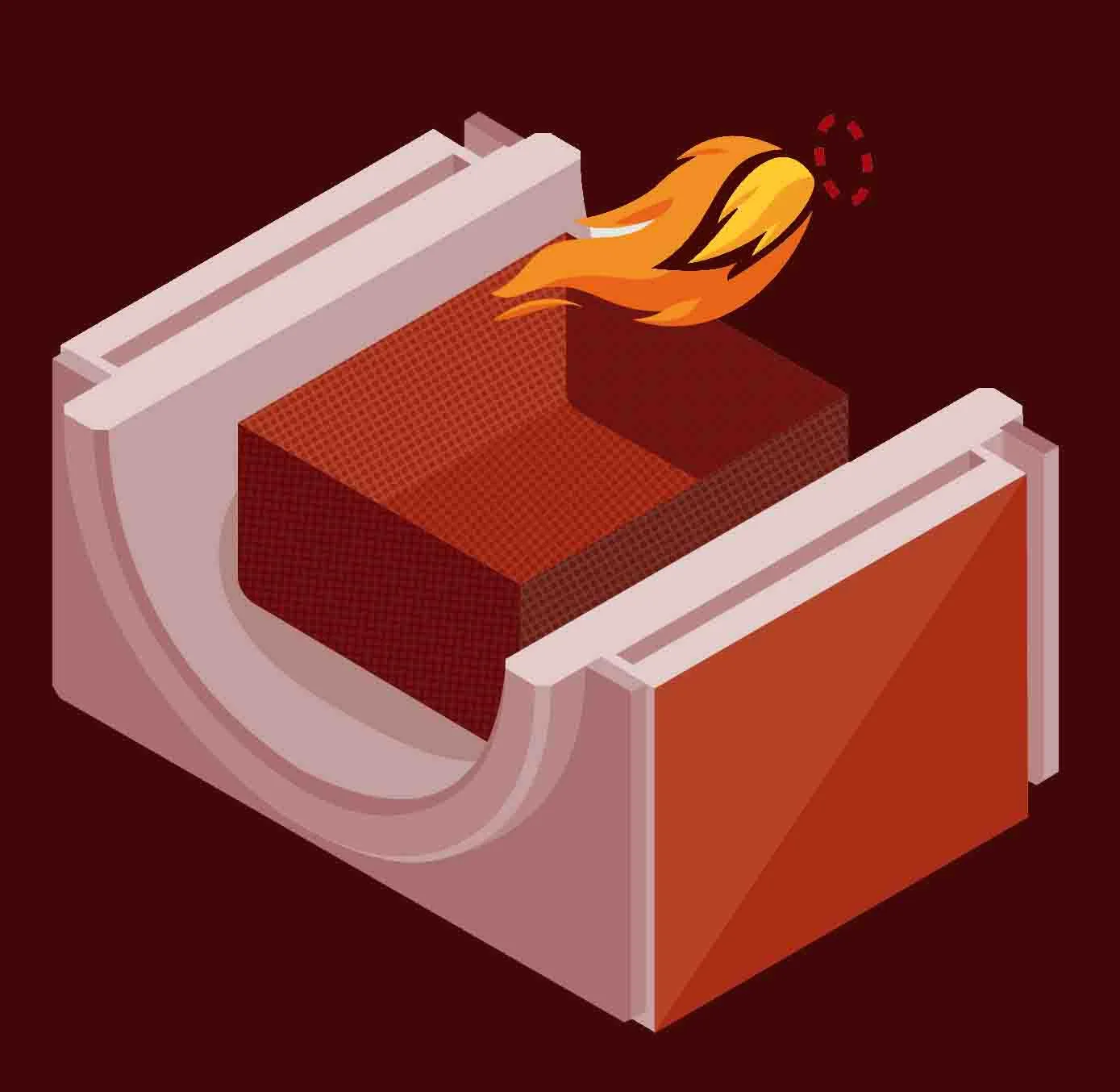
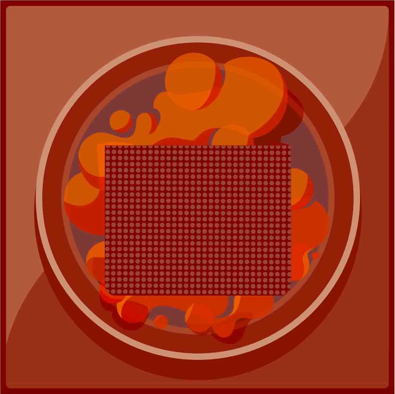
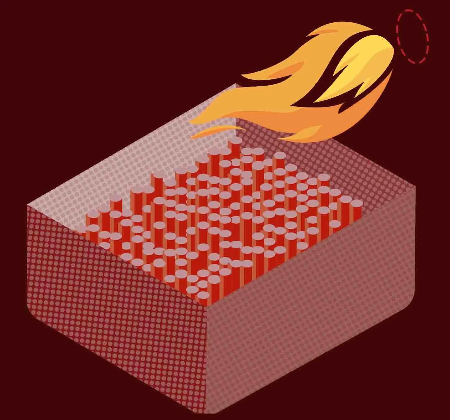
Process illustrations, from loading the parts to final inspection
2024 · Designed at Log-e, for one of its clients
Role, scope and status my contribution · 8 facts
ST Sbavatura Termica has removed burrs from metal parts with heat since 1979, for automotive, aerospace and industrial manufacturers around the world. Their know-how was world class; their brand and website were not. In 2024 I rebuilt both: from research to logo, colour, illustration, UX and a website in five languages.
| Client | ST Sbavatura Termica, Monza · thermal deburring since 1979 |
| Context | Designed at Log-e, for one of its clients |
| My role | Art Director & Lead Designer |
| Strategy | Market and competitor analysis, brand audit, positioning |
| Identity | Logo, colour system, typography, illustration language |
| Digital | Information architecture, UX/UI design, localisation in five languages |
| Year | 2024 |
| Live | stdeburring.com ↗ |
01 — See
World-class know-how, a brand that didn’t show it.
What was wrong, and the fix.
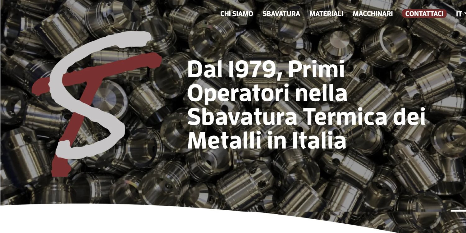
The old website had the right facts and the wrong form: long blocks of text, a hand-drawn logo, generic icons and one language only. I compared it with thermal deburring companies and machine makers in Europe and the US. The findings fell into four areas, each with a clear fix.
Finding · UX and navigation
Information was buried in long, unstructured text.
Design response
Clear headings, short sections and summaries, in five languages.
Finding · Engagement
No easy way to ask or test, and almost no visuals.
Design response
An FAQ, a free-test call to action, real photography, illustrations and video.
Finding · Branding
A weak logo and a dated, inconsistent look.
Design response
A new logo and one system across site, trade fairs and social media.
Finding · Environment
Sustainability and certifications were barely mentioned.
Design response
A clear sustainability statement and the TÜV certification up front.
From my market research and brand framework for ST, July 2024.
02 — Understand
Logo and colour, built around heat.
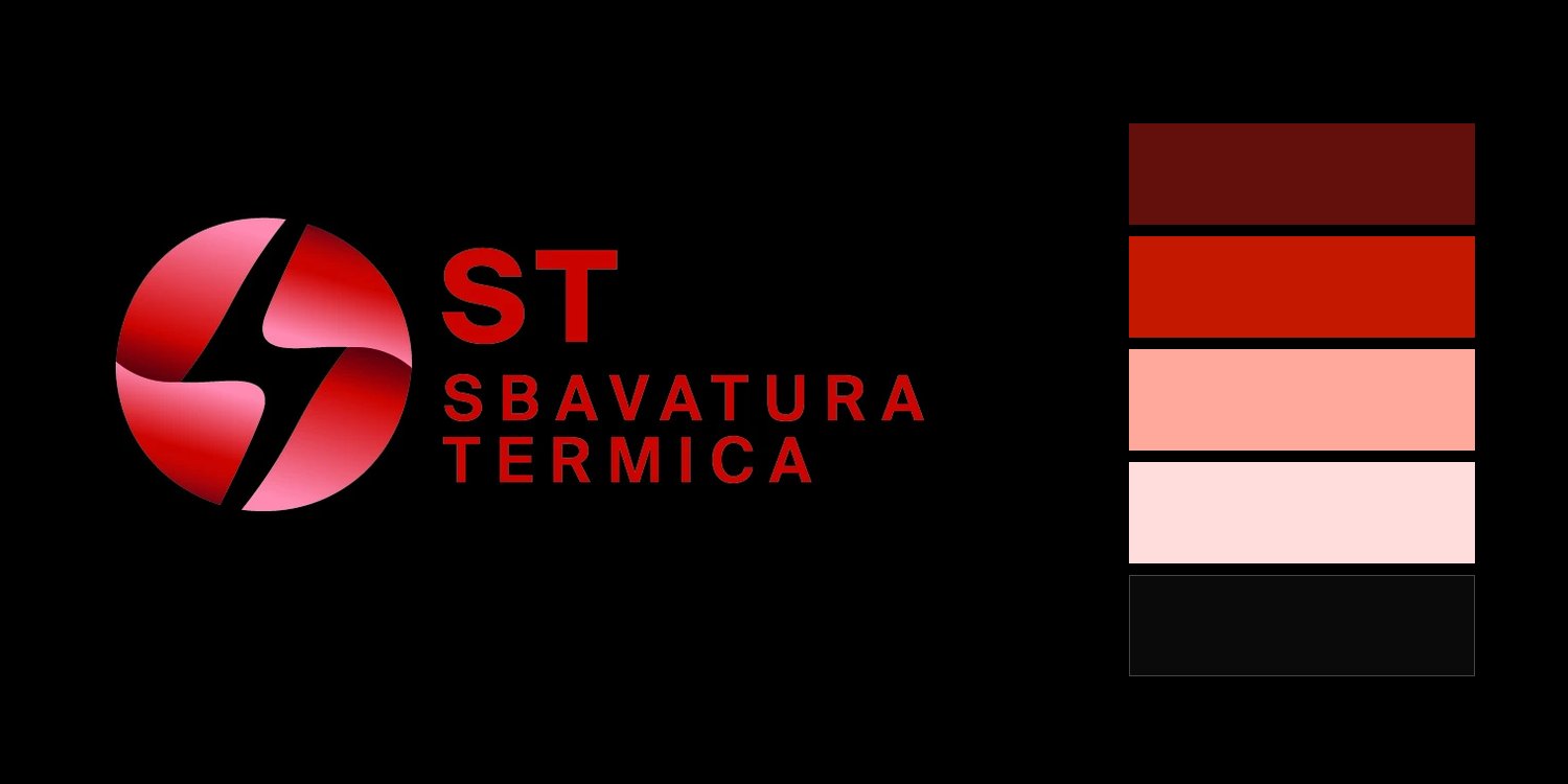
The previous hand-drawn monogram had low legibility and did not scale to small sizes, embroidery or signage. The final mark is a sphere divided by a spark-shaped cut, a reference to ignition in the deburring chamber, set in a red gradient, with the name in spaced capitals for a precise, technical voice.

Colour system
Heat, in five tones.
A red system built around heat: deep red for type and backgrounds, a bright heat red reserved for actions, two light tints for surfaces, and near-black for the website, like the inside of the chamber.
Process illustration system
A set of four illustrations explains the process in the brand palette, from loading the parts to final inspection. Select a stage.
The mark at every size mark · on black · 4 sizes

 96 px48 px24 px16 px
03 — Make clear
A website organised around the buyer’s questions.
The site is organised around what industrial buyers need to know: what thermal deburring is, which materials it works on, how the process runs, which machines ST uses, and how to request a test.
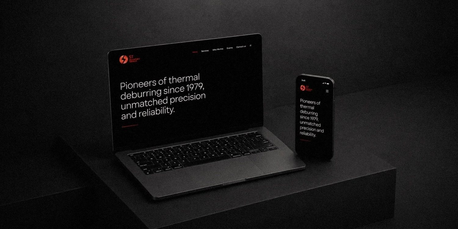
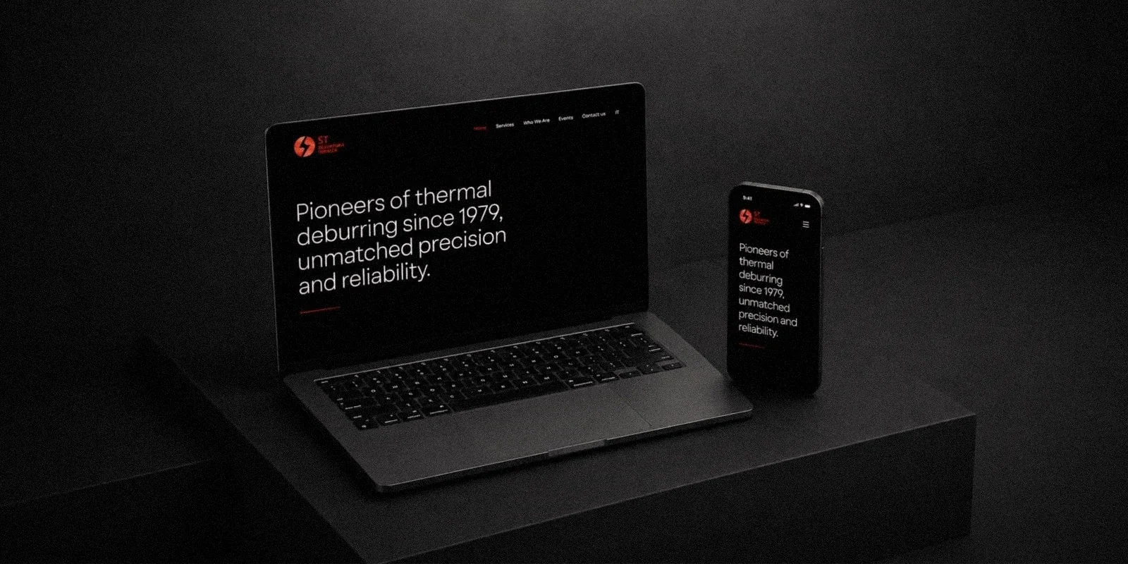
Short technical explanations, process illustrations and a free-test call to action on every page make ST’s expertise easy to explore and contact easy to start. Visually, the site is dark and high-contrast, with one red accent reserved for actions; the same structure runs in all five languages.
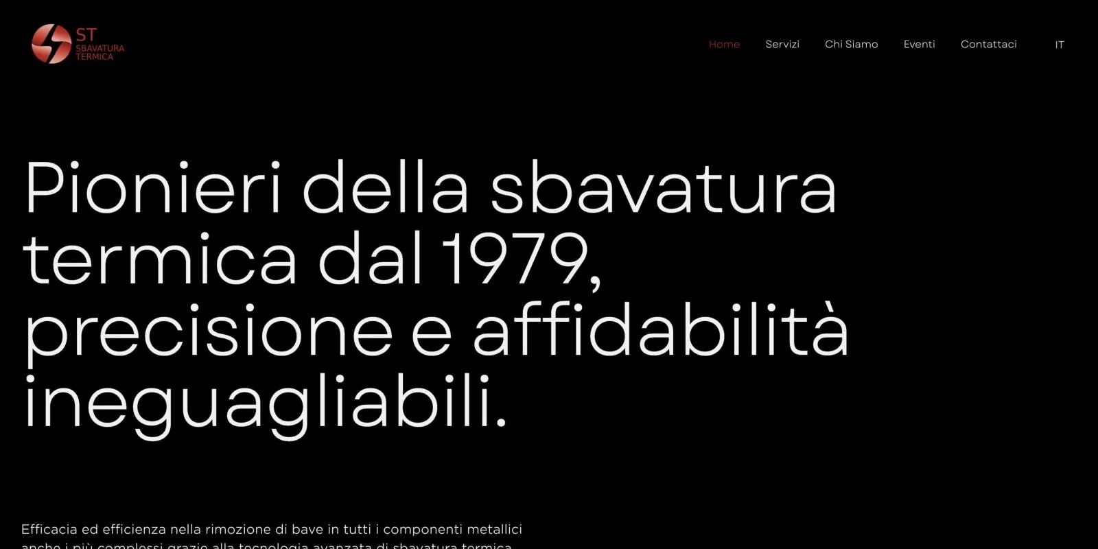
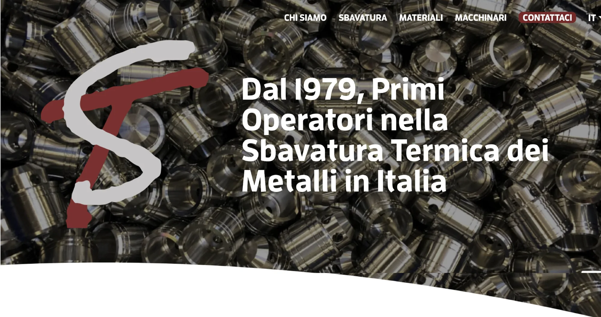 AfterBefore
Localisation
Five languages, one layout.
The site is localised in Italian, English, German, Turkish and Chinese for an international client base. The same promise runs from 26 to 88 characters, so every layout was designed for its longest language.
Delivered
One consistent brand across web, trade fairs and social media.
The delivered system covers the logo, colour, illustration, a five-language website and social channels. The new brand and website provide a consistent presence for international B2B audiences: a site that explains the process in their language, and a presence at international trade fairs from Istanbul to São Paulo and Chiba.
Client response
ST’s owners were very happy with the result: a brand identity that finally matched their expertise, a process explained clearly enough for any buyer, and visuals they could use everywhere.
The website in motion home page scroll · desktop and mobile
Back to the first project · 01
Elegant Menu.
From automation to control.