Art direction · Brand identity · Digital design · B2B industrial · 2024
ST deburring.
Rebrand, art direction and website redesign for a thermal deburring company working since 1979.
01Overview
Rebrand and digital presence for a thermal deburring pioneer.
ST Sbavatura Termica has removed burrs from metal parts with heat since 1979, for automotive, aerospace and industrial manufacturers around the world. Their know-how was world class; their brand and website were not. In 2024 I rebuilt both: from research to logo, colour, photography, illustration, UX and a website in five languages.
- Client
- ST Sbavatura Termica, Monza · thermal deburring since 1979
- My role
- Art Director & Lead Designer
- Strategy
- Market and competitor analysis, brand audit, positioning
- Identity
- Logo, colour system, typography, illustration language
- Digital
- Information architecture, UX/UI design, localisation in five languages
- Imagery
- Art direction, product photography
- Year
- 2024
02Before and after
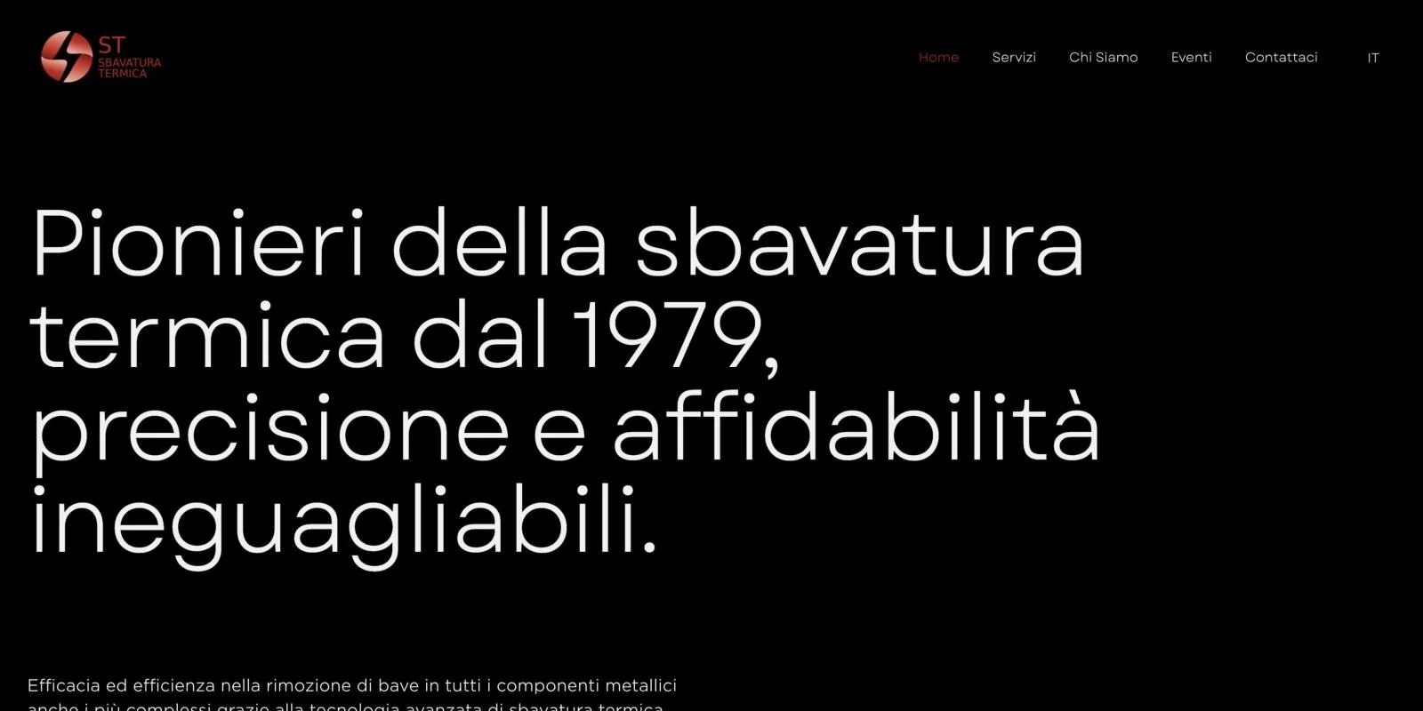
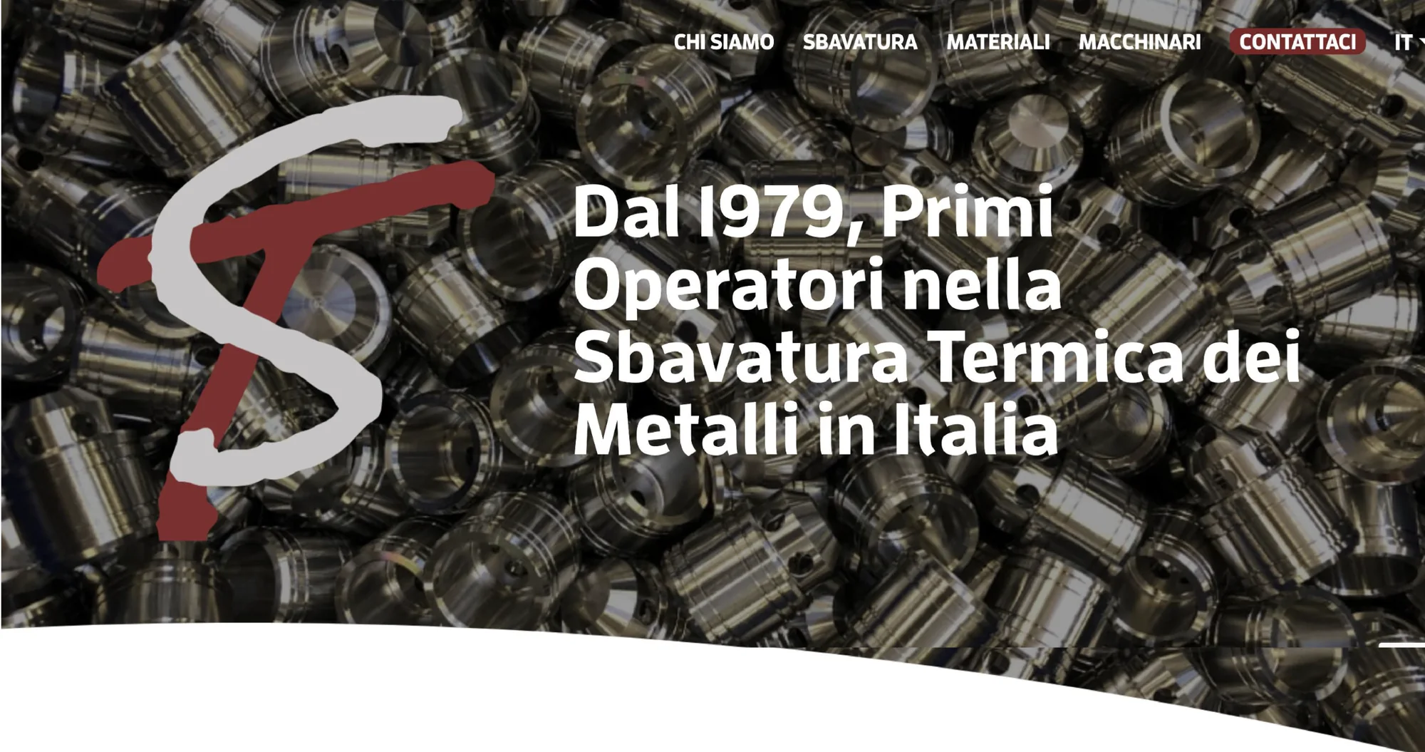
The homepage, redesigned.
The homepage before and after the redesign. Drag to compare.
03Brand audit
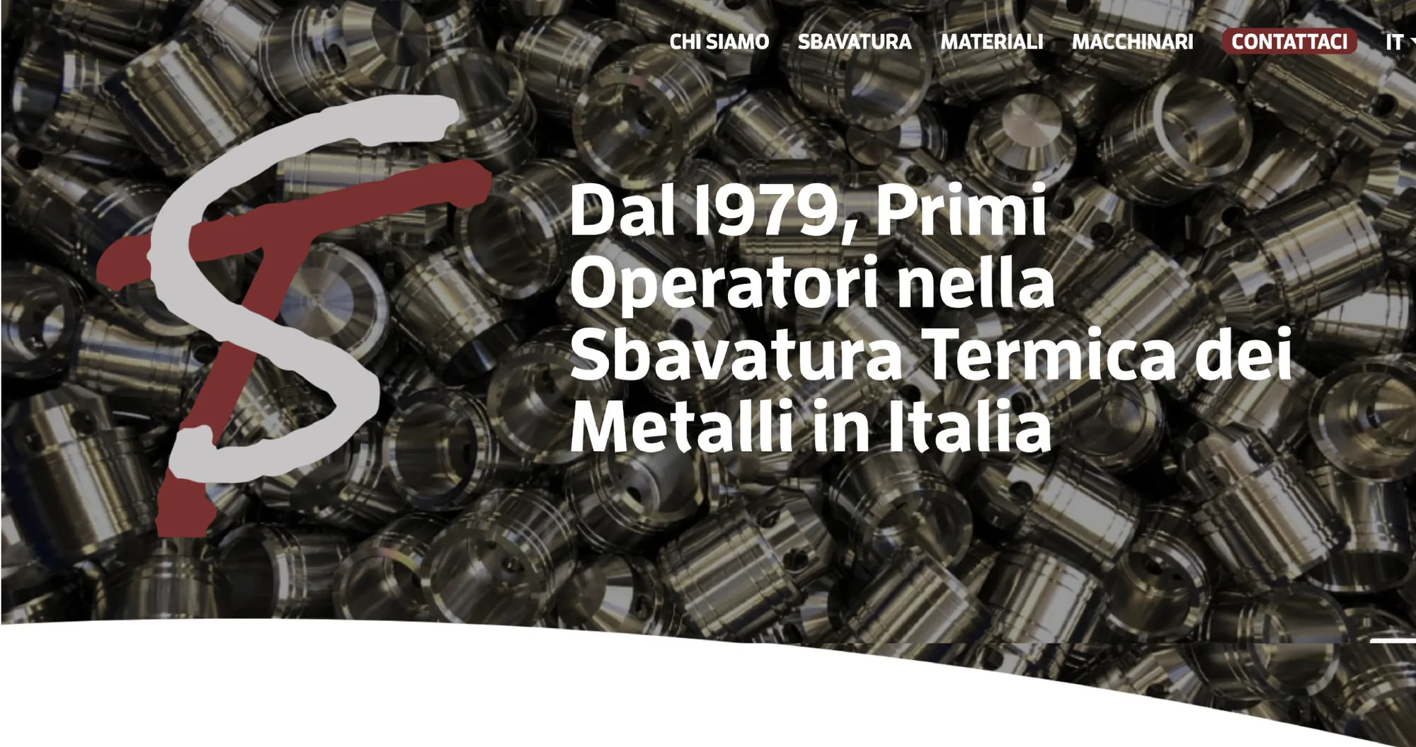
The existing brand and website.
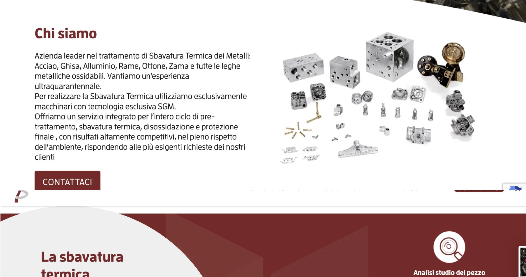
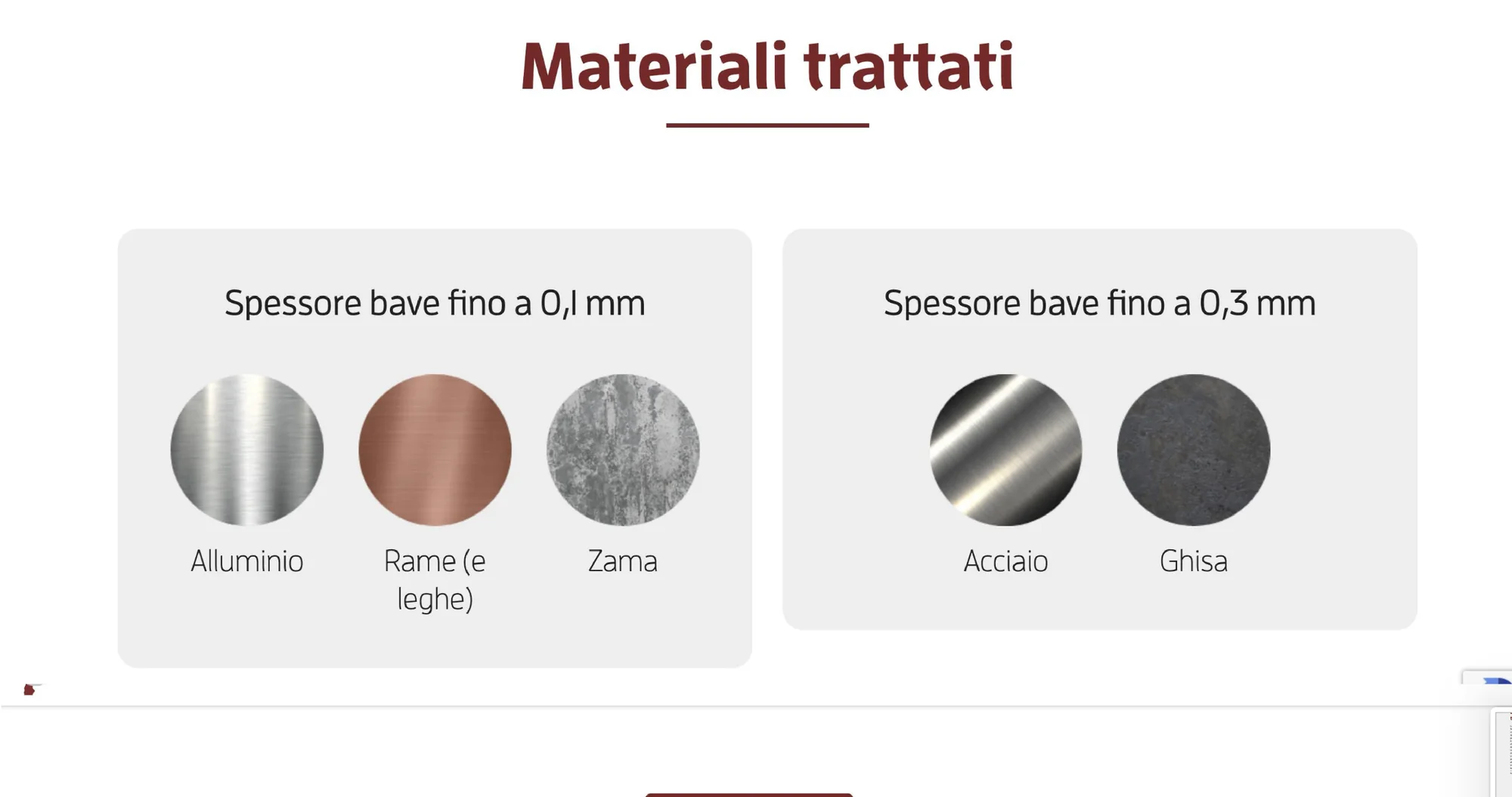
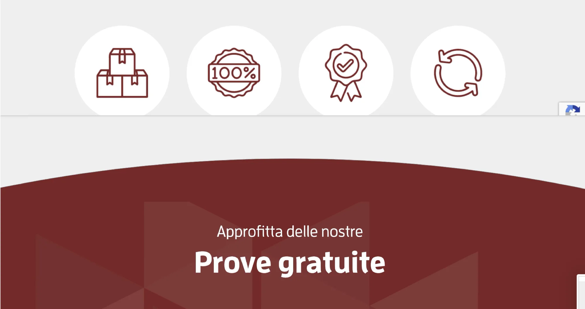
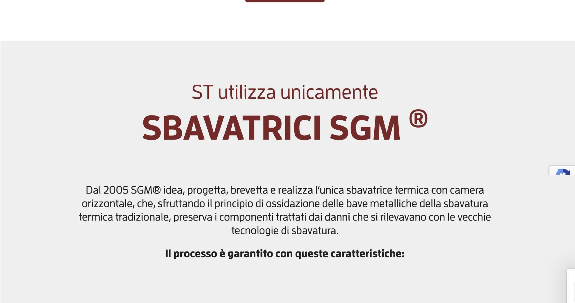
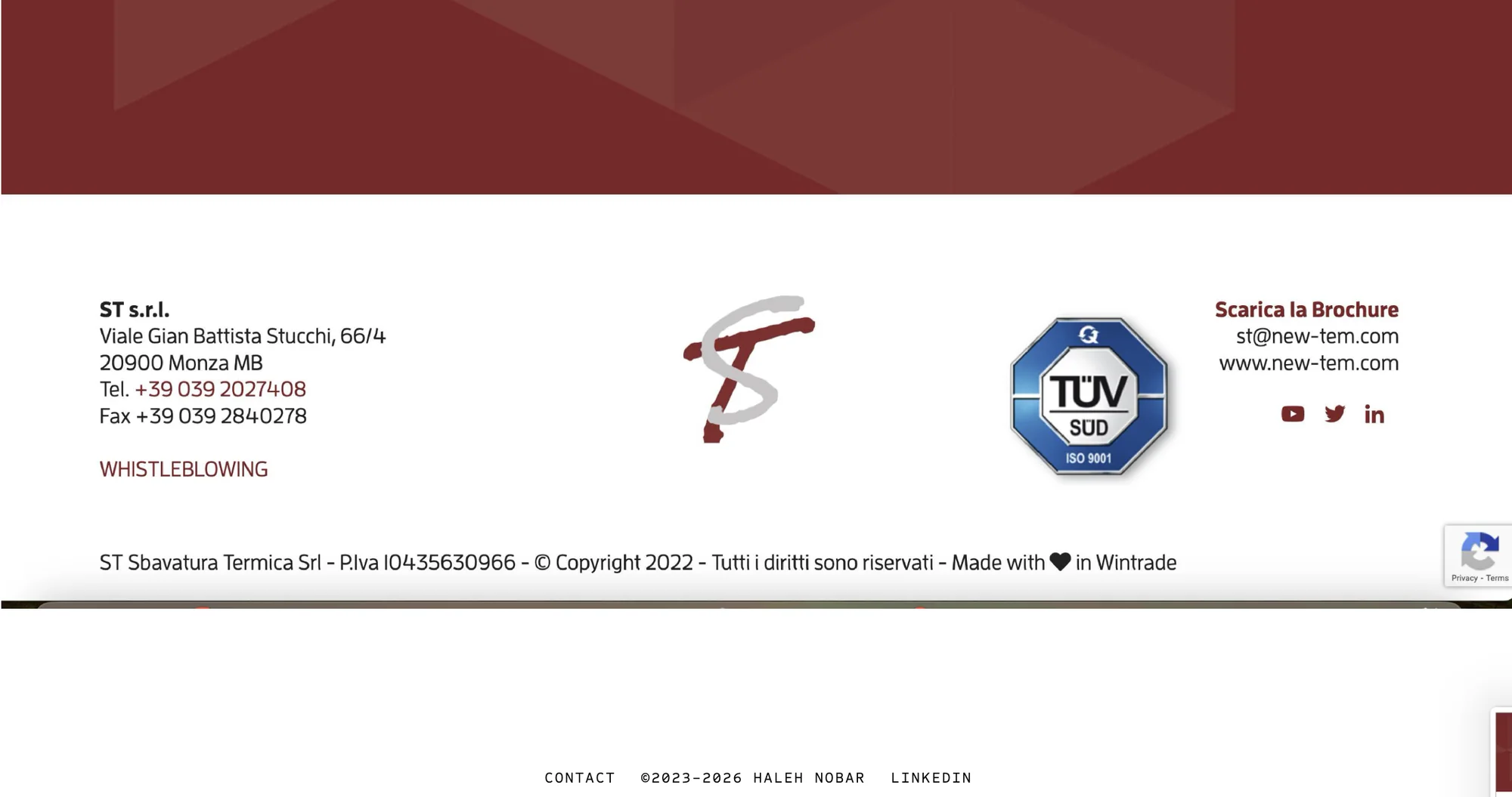
The old website had the right facts and the wrong form: long blocks of text, a hand-drawn logo, generic icons, stock pictures on a grey background, and one language only. A buyer had to dig for what ST actually does.
04Market research
Competitive analysis and UX audit.
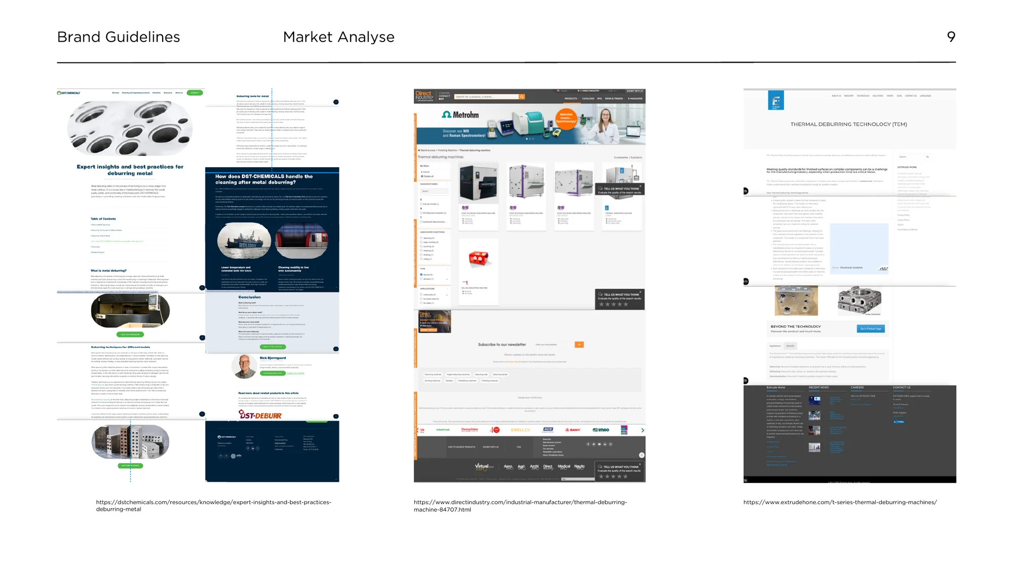
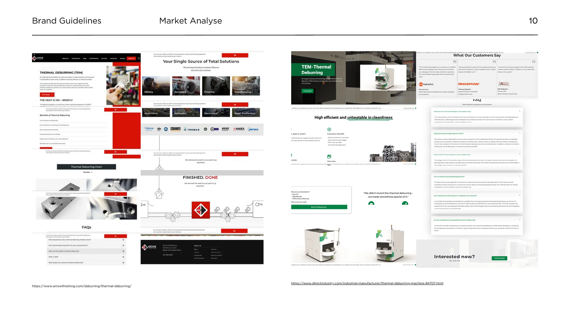
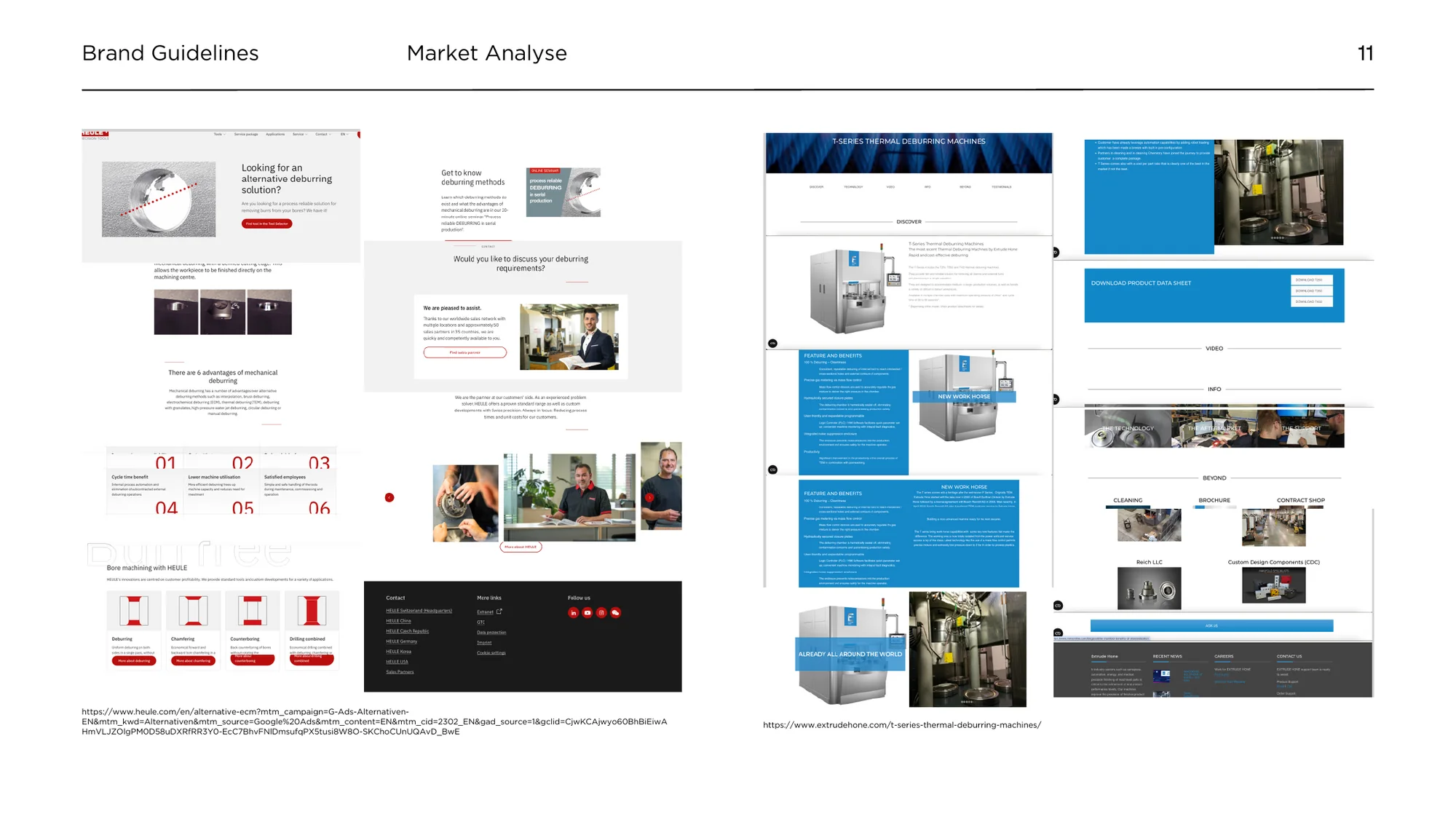
I started with a market analysis of thermal deburring companies and machine makers in Europe and the US, then audited the old site against them. The findings fell into four areas, each with three problems and the fix for each.
UX and navigation
Hard to find information in text-heavy pages; no headings or summaries; an outdated, overwhelming layout.
→ Clear headings, short sections and summary boxes; a modern interface; five languages.
Engagement
No Q&A or contact points; few case studies; almost no images, infographics or video.
→ FAQ and a free-test call to action; real photography, process illustrations and video.
Branding
A weak logo; inconsistent elements; an outdated first impression.
→ A new logo and one consistent system across site, fairs and social media.
Environment
Little on sustainability, policies or certifications.
→ A clear sustainability statement and the TÜV certification up front.
From my market research and brand framework for ST, July 2024.
05Visual identity
Logo redesign.
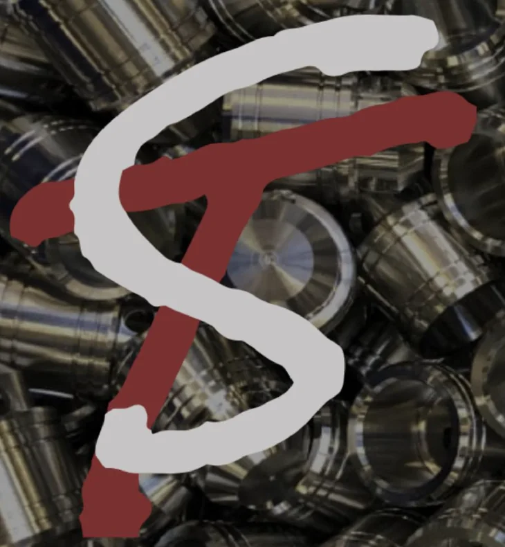
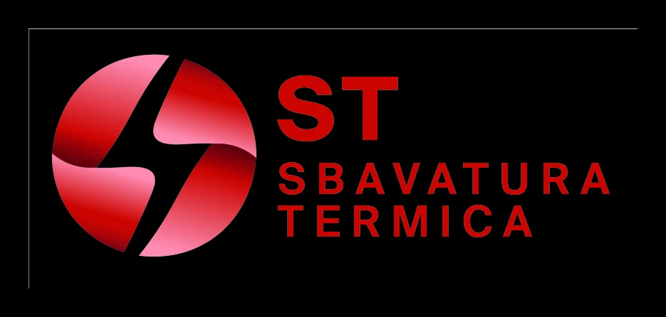
The previous hand-drawn monogram had low legibility and did not scale to small sizes, embroidery or signage. The final mark is a sphere divided by a spark-shaped cut, a reference to ignition in the deburring chamber, set in a red gradient, with the name in spaced capitals for a precise, technical voice.


 96 px48 px24 px16 px
06Colour system
Heat, in five tones.
A red system built around heat: deep red for type and backgrounds, a bright heat red reserved for actions, two light tints for surfaces, and near-black for the website, like the inside of the chamber.
07Illustration
Process illustration system.
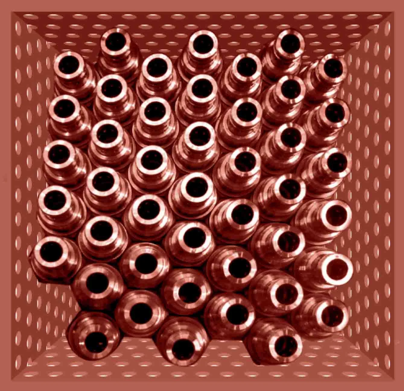
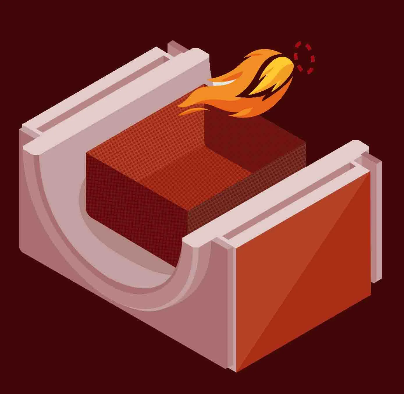
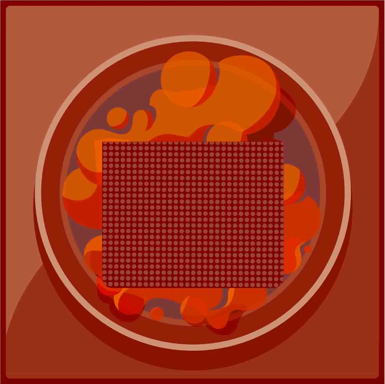
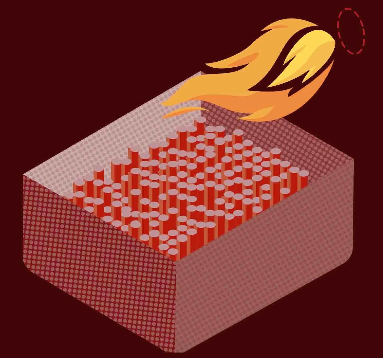
A set of four illustrations explains the process in the brand palette, from loading the parts to final inspection. Select a stage.
08Art direction & photography
Product photography.
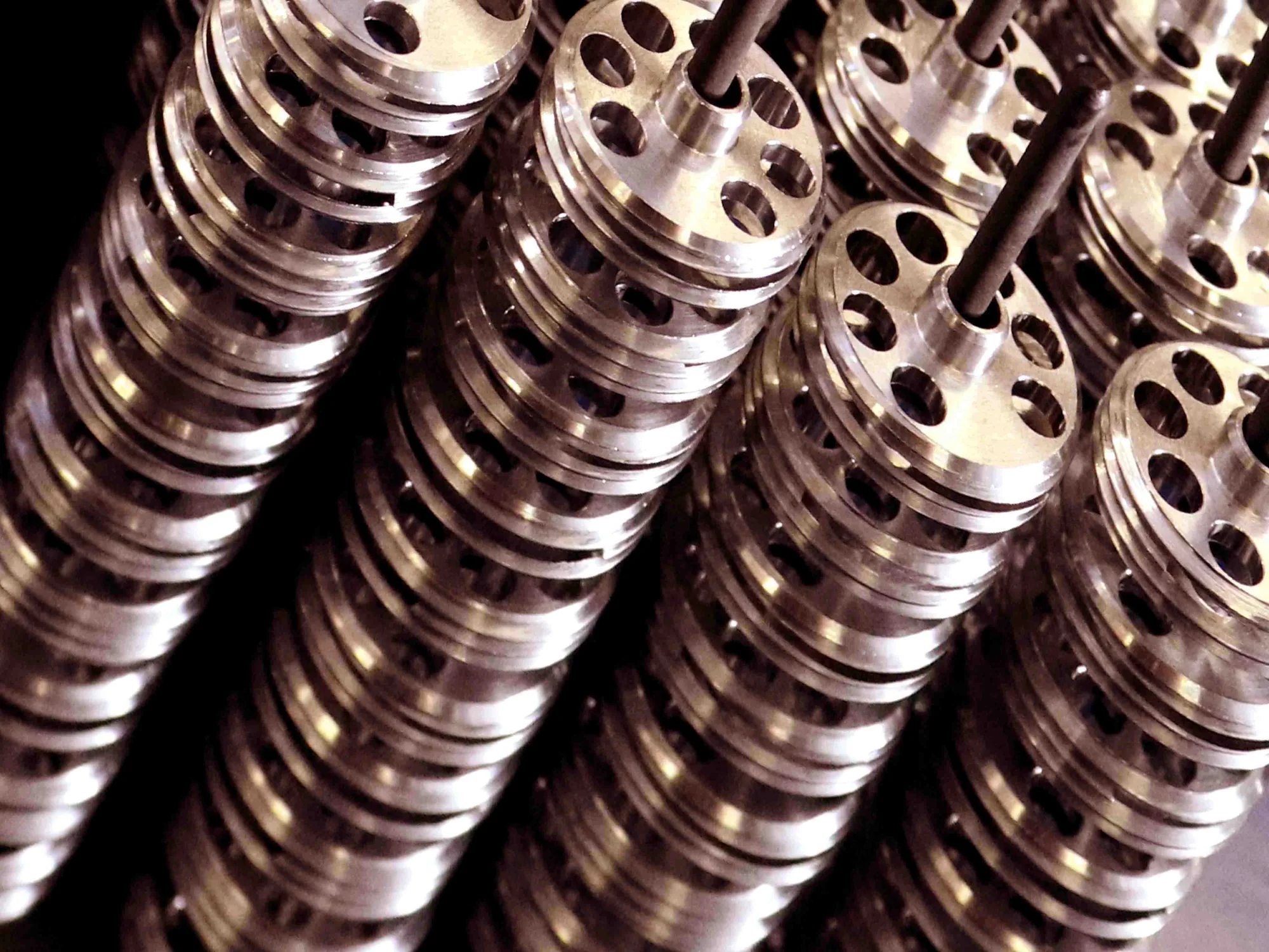
Art direction and photography of the client’s own components, shot in the workshop to replace stock imagery. A single warm copper grade connects the series and carries across the website, trade-fair materials and social media.
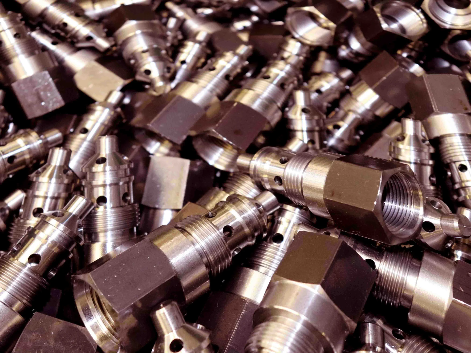
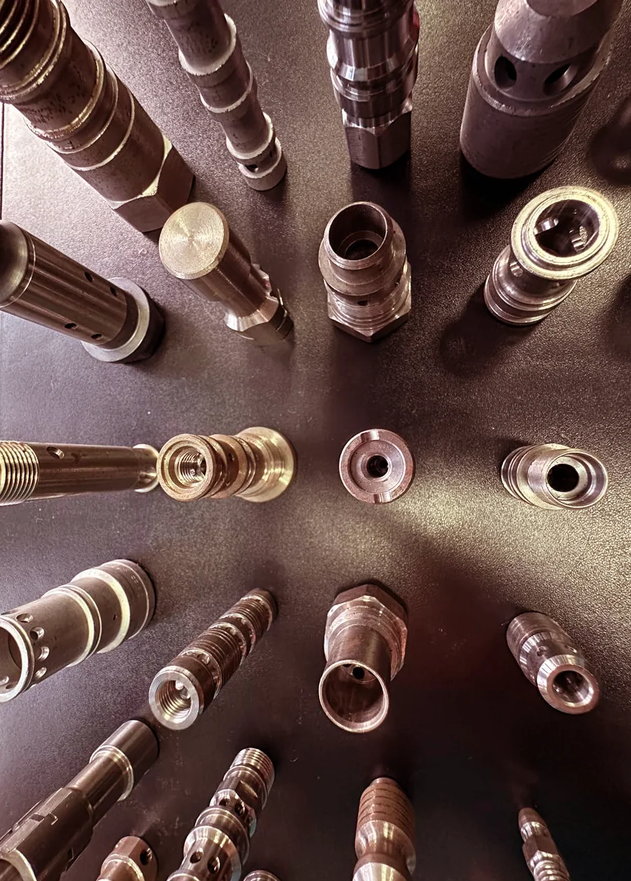
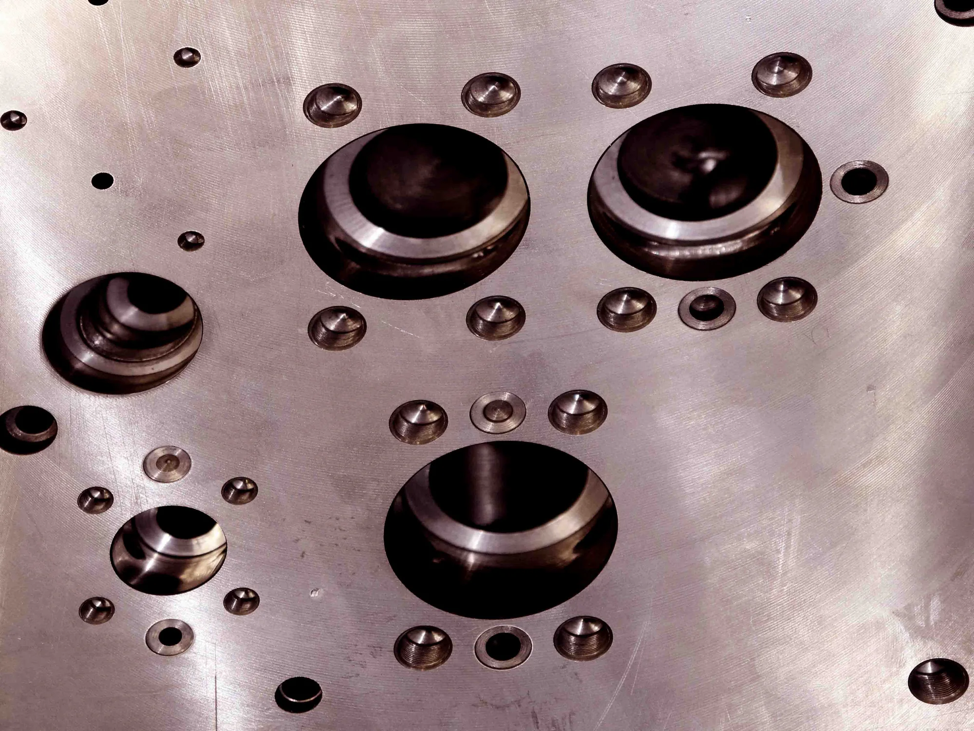
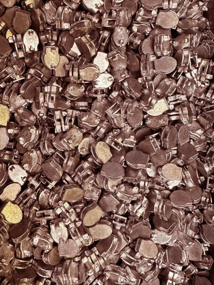
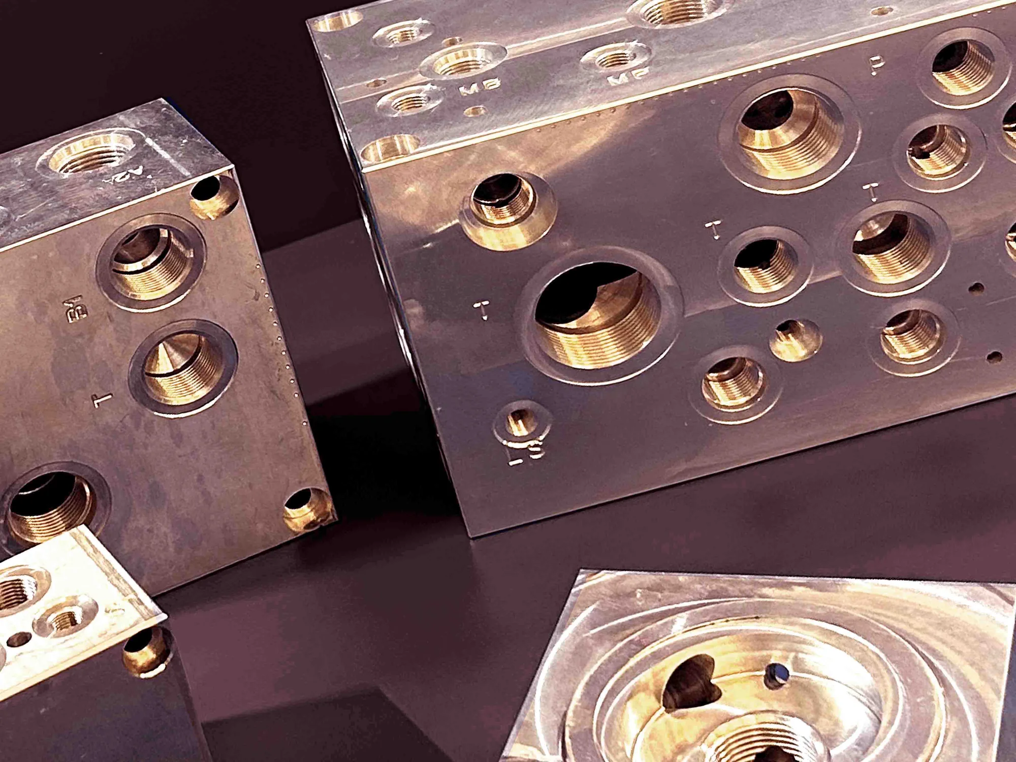
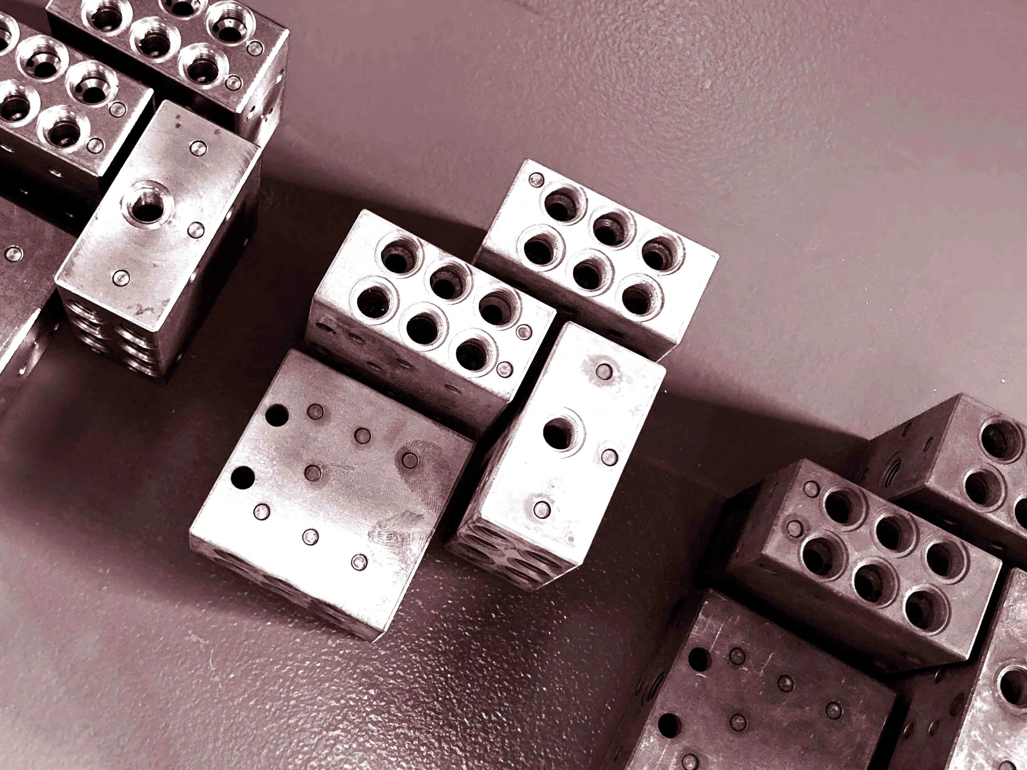
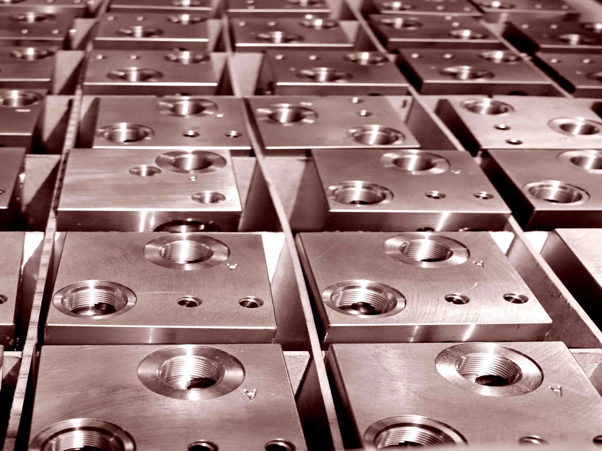
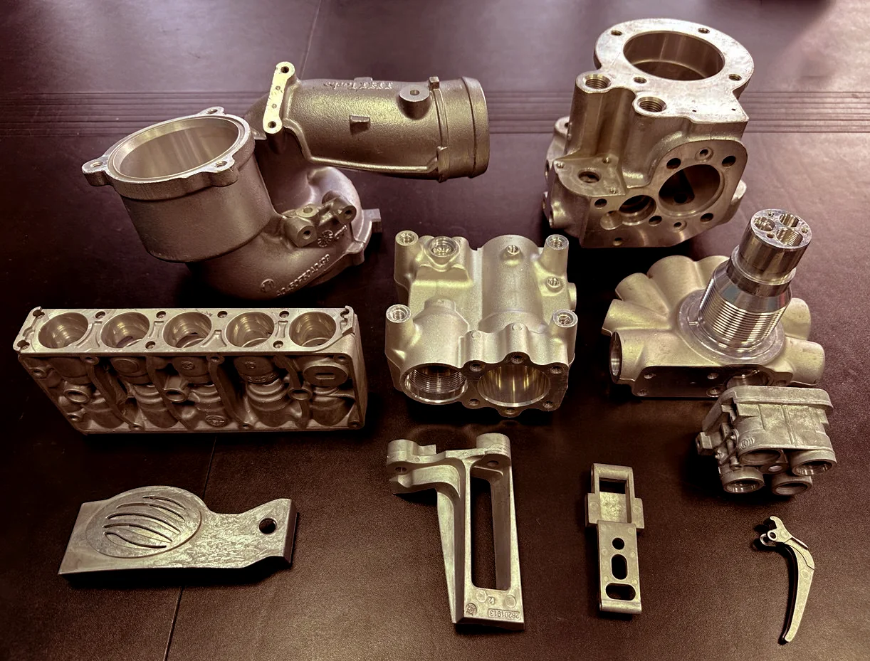
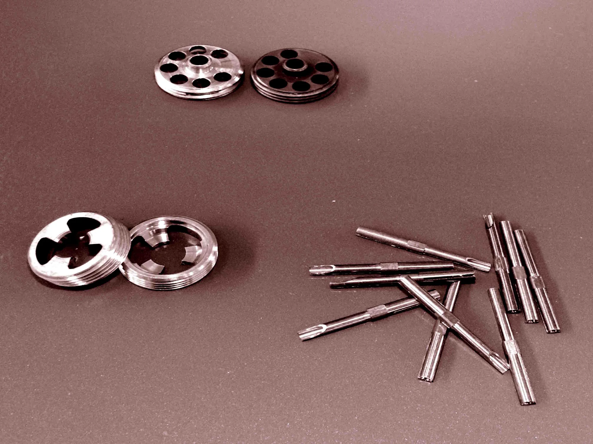
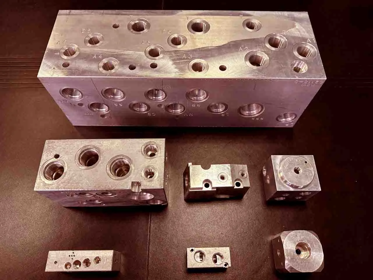
Photography by Haleh Nobar. Click any photo to see it large.
09UX & web design
Website redesign.
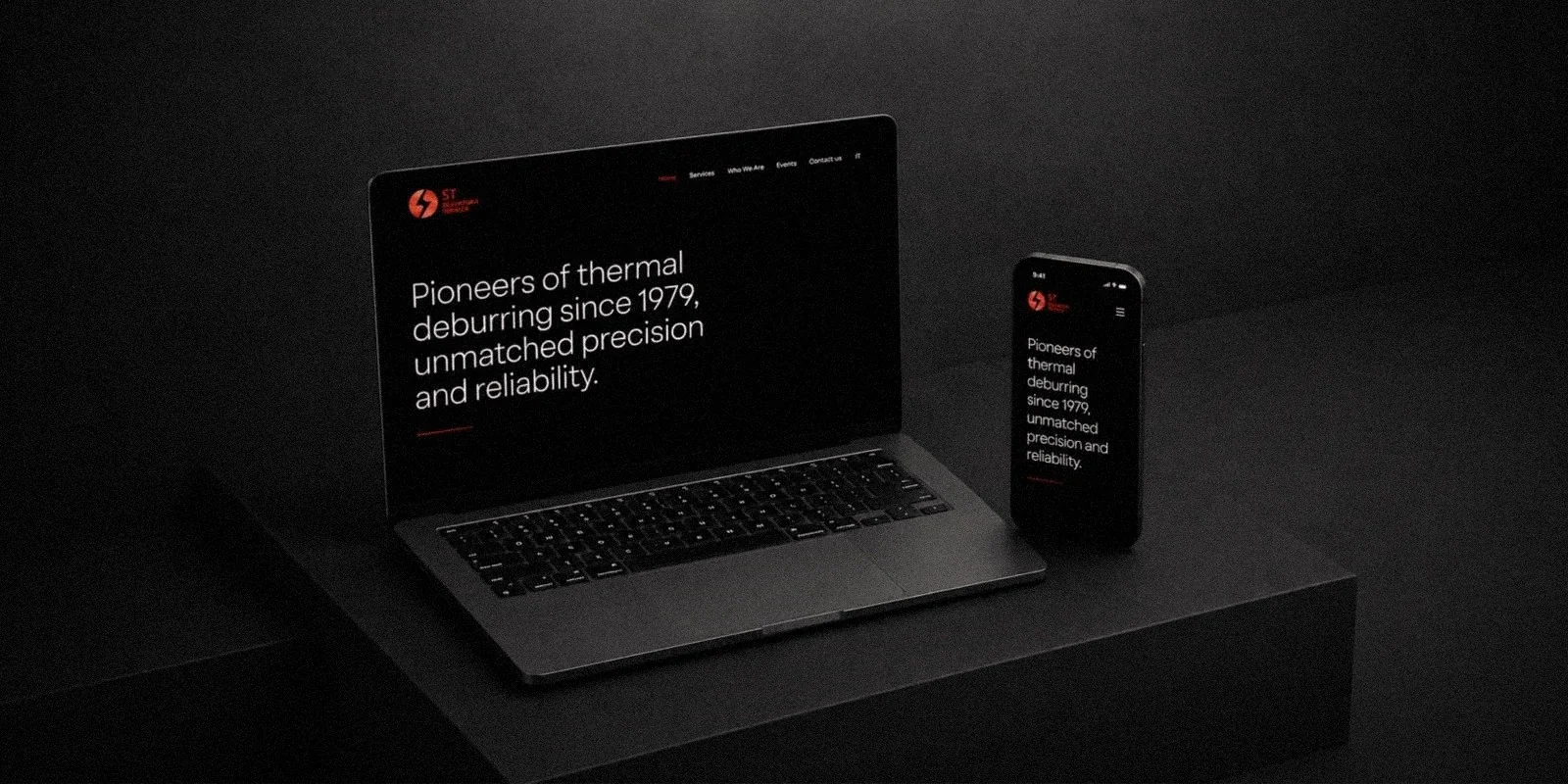
Information architecture and interface design for a dark, high-contrast site: clear hierarchy, short sections, one red accent reserved for actions, and the free test available from every page.
10Localisation
A five-language website.
The site is localised in Italian, English, German, Turkish and Chinese for an international client base. The same promise runs from 26 to 88 characters, so every layout was designed for its longest language.
Pionieri della sbavatura termica dal 1979, precisione e affidabilità ineguagliabili.
Italiano84 characters
11Outcome
One consistent brand across web, trade fairs and social media.
One consistent brand across logo, website and social channels. ST now meets global B2B clients with a site that explains its process in their language, and a presence at international trade fairs from Istanbul to São Paulo and Chiba.