Hard to explain.
Lead product designer · Milan
That’s where I start. I design complex B2B SaaS and AI-powered products, and make them clear enough to use, and to trust.
Explore selected work ↓01Case study · Log-e · 2023 — 25
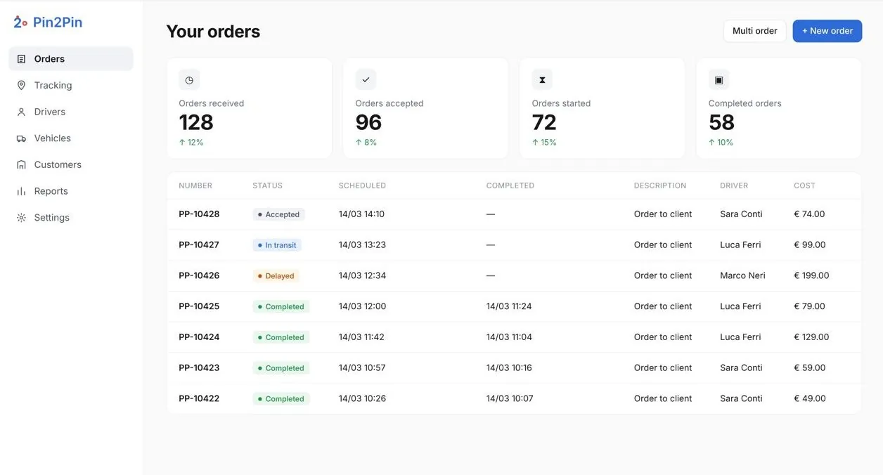
Pin2Pin.
Fleet operations went dark once orders left the office.
One order, visible to the office and provable on the road.
In the dots: one order’s route, from the office to the doorstep.The real thing: the driver app and the office dashboard, in use.
−40%status calls, as reported by Log-e
Read the case study →02Case study · Politecnico di Milano · 2022
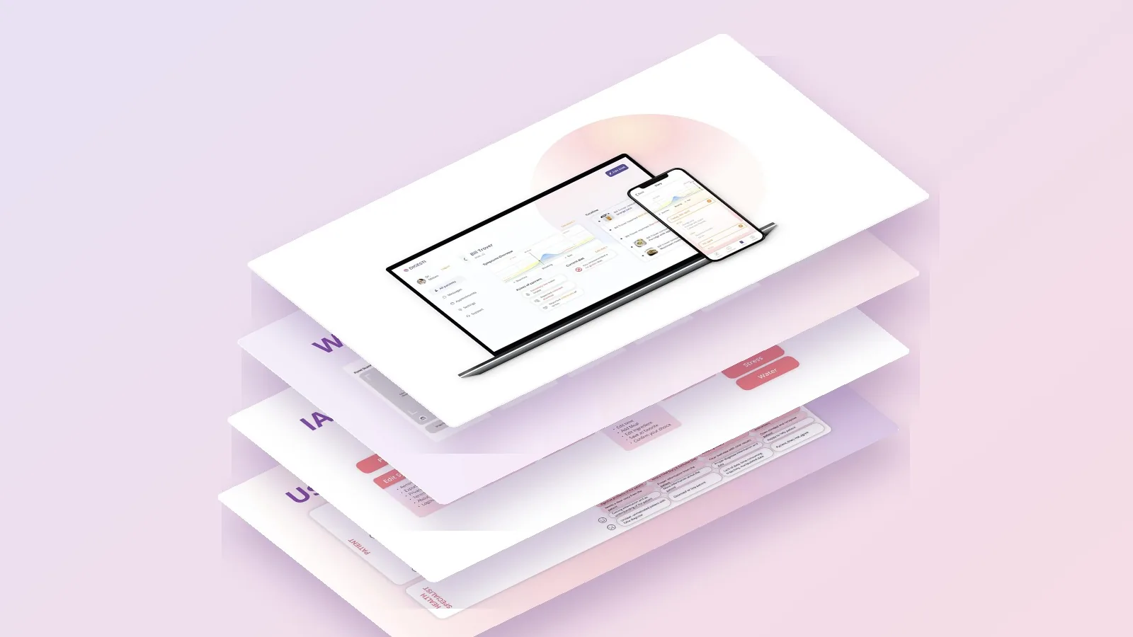
Digesti.
Weeks of food diaries for an intolerance diagnosis.
One photo per meal; the specialist sees the whole history.
In the dots: a week of meals and symptoms, the way the specialist reads it.The real thing: the patient app, chatbot and specialist web app.
3connected products: patient app, chatbot and specialist web app
Read the case study →03Case study · DensityDesign Lab · 2022 — 23
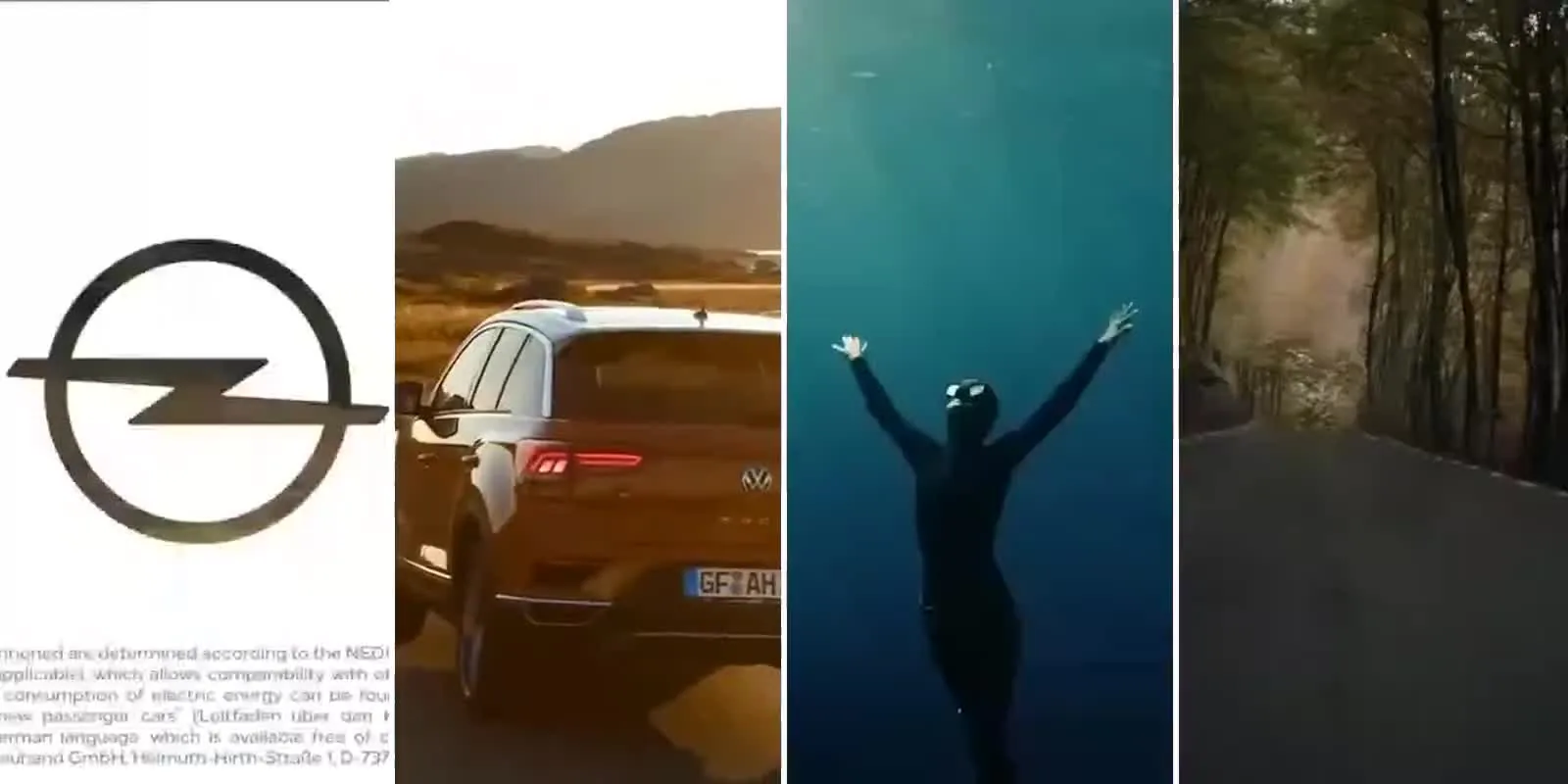
A Highway to Greenness.
How 90 car adverts look green without saying it.
Five patterns, counted; four turned into short videos.
In the dots: one dot per advert, 30 per engine, filled where the pattern appears.The real thing: the adverts, frame by frame, in strips.
4short videos from 90 adverts, each read three times
Read the case study →04Lead product designer · 2023 — now
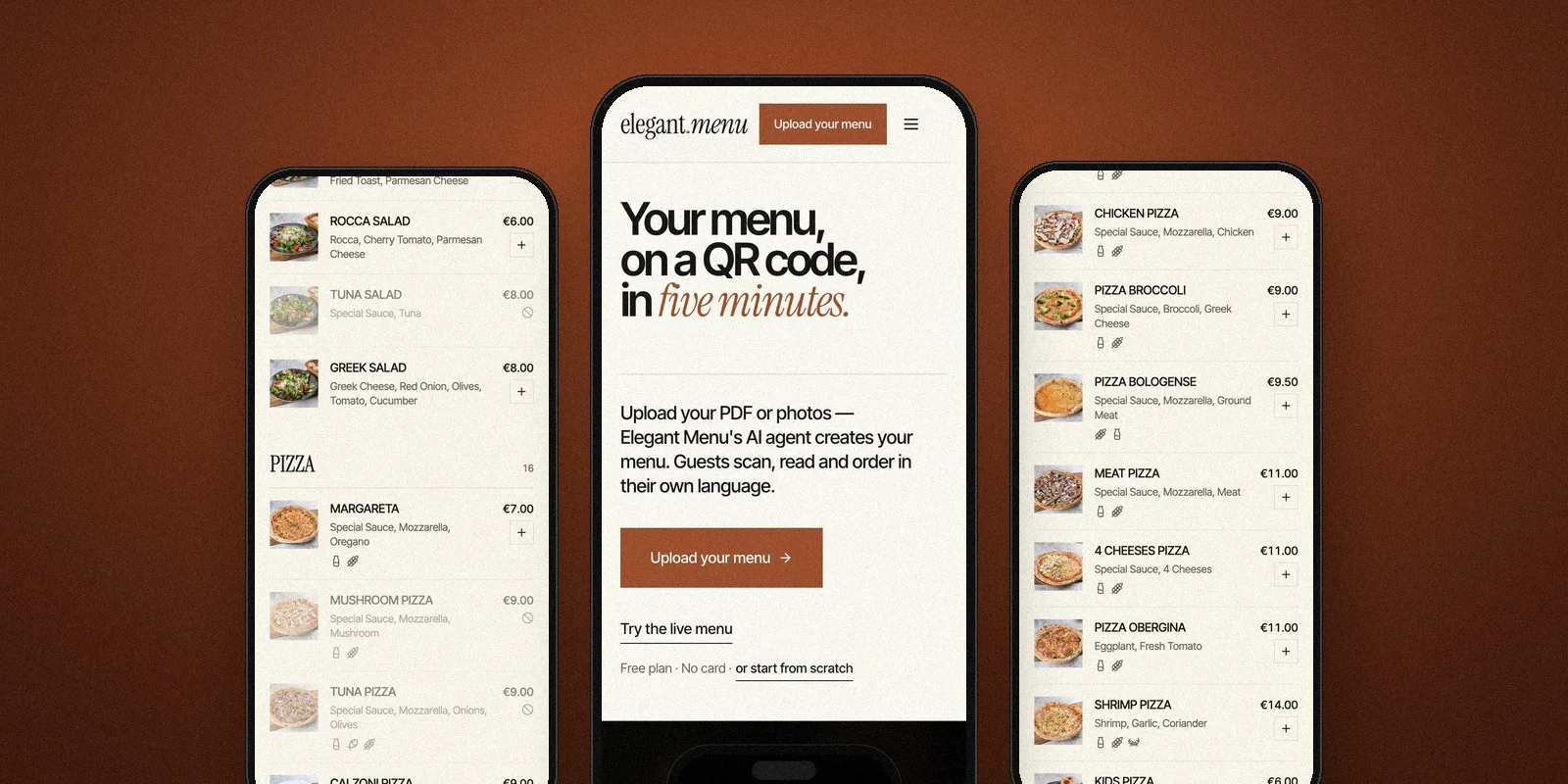
Elegant Menu.
A QR menu and ordering platform for restaurants, bars and hotels.
A menu on a QR code, in many languages, ready in minutes.
In the dots: a working QR code. Point your phone at it.The real thing: the live menu on a guest’s phone.
5,600+restaurants, bars and hotels use it
See Elegant Menu →05MSc thesis · Politecnico di Milano · 2025
Forkful by Forkful.
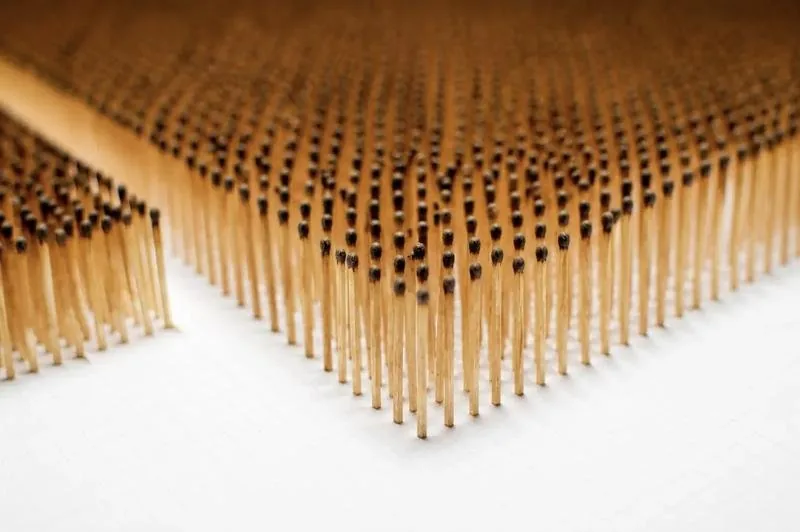
Three infopoetry pieces about food. This one is Burned Indulgence.
Burned Indulgence: a month of Italy’s sugar against the WHO’s ideal, in burnt matches.
In the dots: Italy’s month of sugar next to the WHO’s, match by match.The real thing: the installation, burnt matches on a white board.
2,640burnt matches next to 750: the sugar you don’t see, made countable
See Burned Indulgence →01Selected work
Selected work
- 01Pin2PinB2B logistics · Shipped product−40% status calls, as reported by Log-e
- 02Elegant MenuHospitality · Live product5,600+ restaurants, bars and hotels
- 03DigestiHealthcare · UX researchPatient app, chatbot and specialist web app
- 04A Highway to GreennessResearch · Data storytelling90 car adverts, five patterns
- 05Forkful by ForkfulMSc thesis · Data art2,640 burnt matches: Italy’s sugar, made countable
02Also designed
Smaller things, made just as clear.
Each drawing is live. Play with it, then open the project.
ABrand and web · Client
ST Sbavatura Termica →
A precise identity and a five-language website for a thermal deburring specialist, since 1979.
BInformation design · Politecnico di Milano
K Nearest Neighbor →
A video-game poster that explains how a machine classifies the unknown.
CFront end · ELO 2022 Mentoring Exhibition
The Little Prince’s Journey →
An interactive web story, built in HTML, CSS and JavaScript. Selected for exhibition.
Swipe for more →
Before product design: conceptual illustration, selected for Euro-kartoenale 2021. See the cartoons →
03Contact
Have something
hard to explain?
Open to full-time product design roles in B2B SaaS and AI-powered products · hybrid or remote, Europe.